How to Turn a Product Photo Into a 6–15s Ad Video with Seedance 2.0
Create short ad clips from a product photo: shot plan, prompt templates, brand safety checks, and common ecom failure fixes.
Looking for video generation with fewer restrictions? Try these top models on WaveSpeedAI:
WAN 2.7 | Veo 3.1 Fast T2V | Veo 3.1 Fast I2V | Sora 2 T2V | Sora 2 I2V | Kling | Vidu
A small friction pushed me here. I had a clean product photo, a draft line I liked, and a deadline creeping in. What I didn’t have was motion, the kind that says “pay attention” without sounding desperate. So I tried Seedance 2.0 for one job: turn a single product shot into a short ad video (6–15 seconds) that I could actually run.
I’m Dora. This isn’t a review. It’s how it felt to build a compact ad from one still image. Where it worked, where it strained, and what I’d do again.
Pick an ad structure (hook → proof → CTA)
I used to skip structure, assuming I could improvise in the editor. That always cost me time. With Seedance 2.0, deciding the arc first matters more because the prompts lean on intent. I landed on a simple spine:
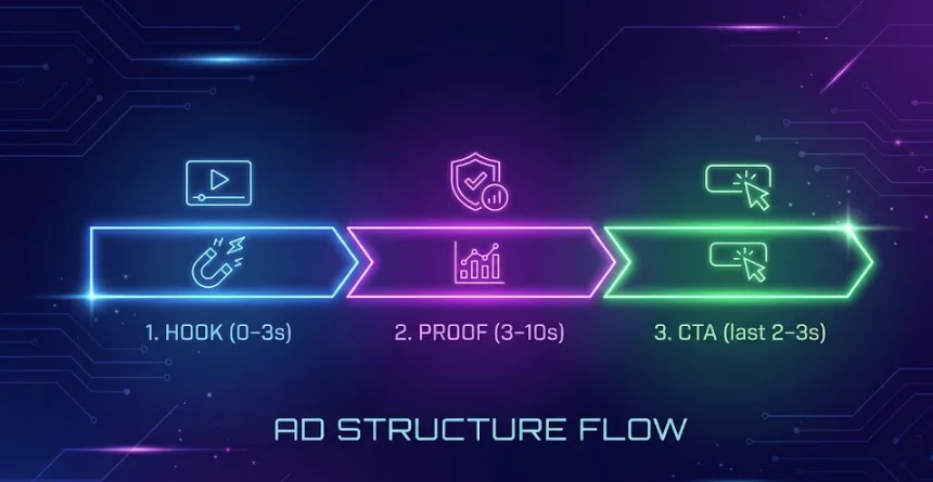
- Hook (0–3s): one strong movement. No text yet, just a clean reveal.
- Proof (3–10s): a concrete benefit or detail, not everything, just one.
- CTA (last 2–3s): a nudge. Short. Legible on a phone.
My first pass was a rotating reveal. It looked pretty, but the point got lost. On the second run, I kept the hook to under two seconds and used speed ramps so the product settled by second three. That gave the “proof” room to breathe.
What helped:
- Keep one motion per beat. If the camera rotates, don’t also zoom and pan. Seedance can do it, but the image jitters or the label deforms.
- Budget the time early. If you need 6s total, plan 2s hook, 3s proof, 1s CTA. If you have 15s, don’t fill it: repeat or add one lifestyle cutaway.
- Write the CTA like it’s a caption, not a headline. Two to four words. I used “Free refills.” It read cleanly at 18–24 pt (mobile safe) with high contrast.
Quiet surprise: the shorter my plan, the fewer artifacts I got. When I asked for “smooth parallax + glossy sweep + confetti,” the model obliged, and the logo started to warp. When I picked one verb, tiny problems disappeared.
Input prep for product photos (background, edges, logo safety)
I tested with three sources: a studio PNG on transparent, a JPEG on a light paper backdrop, and a casual iPhone shot. The studio PNG gave the cleanest motion, but the JPEG with a real shadow looked most believable.
Here’s what changed results in practice:
- Background: If your cutout is too perfect, motion can feel floaty. A faint shadow or gradient behind the product anchors the shot. I added a 2–4% soft drop shadow in Figma and re-exported: Seedance respected it.
- Edges: Anti-aliased edges matter. Jagged cutouts lead to “melting” during rotations. I feathered the mask by 0.5–1 px. It cost nothing and reduced edge wobble on 3D-ish moves.
- Logo safety: Keep the logo centered and at least 8–10% inside the canvas on all sides. When the logo kissed the edge, any simulated camera move bent it. I also cloned out micro reflections crossing the logo: glare is a common warp trigger.
- Resolution: 2048 px on the short side was enough. Larger files didn’t improve detail for 1080x1920 exports and sometimes increased hallucinated texture.
- Color and specular cleanup: I desaturated wild highlights and evened out dust with a quick healing pass. The cleaner the input, the less Seedance “invents.”
One misstep: I tried feeding a lifestyle photo with a busy counter and plants. It generated more believable light, but it kept guessing at depth and pulled the bottle halfway behind a leaf that didn’t exist in the original. For control, I now start with the product isolated, then add context later if needed.
Prompt templates (rotation, reveal, lifestyle, macro detail)
I didn’t write poetry. I wrote constraints. These are the small patterns that kept things stable across six runs.
Rotation (safe, minimal):
- “3s slow clockwise turn-in, 10°–15° only, lock logo center, no zoom, studio softbox reflection minimal, smooth easing in–out.”
- Works when the product is symmetrical or close. I capped the angle so labels didn’t stretch.
Reveal (clean, quick):
- “0–2s masked slide from behind soft shadow, stop on center by 2s, then hold steady. Keep background neutral, no particle effects.”
- Feels calm, good for 6s spots where motion shouldn’t distract.
Lifestyle (gentle parallax**):**
- “Subtle background parallax toward 10% depth, product locked, warm afternoon light shift 3% over 5s, grain low.”
- I used this when I wanted vibe without moving the product itself.
Macro detail (proof beat):
- “1.5s push-in to cap texture, 25–35% closer, do not tilt, maintain plane geometry, then return to original framing by 5s.”
- This is where I showed a real material or a feature stamp (e.g., BPA-free) without reading a paragraph.
Small realization: verbs like “lock,” “hold,” and percentages worked better than adjectives. When I wrote “cinematic glossy turn,” results looked… enthusiastic.
”No logo warp” constraints
These saved me the most time:
- “Keep all printed text rigid to source art.”
- “Do not bend, liquify, or redraw label.”
- “Preserve straight baselines: no perspective change on the front face.”
- “Limit camera rotation ≤ 15°, front face stays mostly frontal.”
- “Do not animate micro-reflections on logo region.”
I also added a bounding box note: “Protect 30% center rectangle from deformation.” It isn’t foolproof, but I saw fewer rubbery letters when I said it out loud in the prompt.
QA checklist (brand, geometry, text, hands)
I’ve learned to watch the export like it’s the first time, even if I just rendered it.
Brand
- Color drift: compare hex values or at least eyeball the main brand color at the start vs. end frame. If it warms by more than a click, re-run with “preserve colorimetry: no white balance drift.”
- Logo integrity: scrub at 0.25x speed. Pause every 0.5s and check corners of letters. Any wave means go back and tighten rotation.
Geometry
- Cylinders and boxes: check parallel lines. If sides taper then untaper, the model invented a lens. Add “orthographic feel: no lens breathing.”
- Shadows: if the ground shadow detaches during motion, add a soft static shadow in post rather than asking Seedance to simulate it.
Text
- Packaging small print: don’t fight to make it readable. Keep it as texture unless it’s the proof. If you must show it, freeze frame for 0.7–1.1s and add sharpness in post.
- Overlays: choose one type style, large enough for phones. High-contrast boxes beat wispy drop shadows every time.
Hands
- If you add hands, be strict. I rejected three attempts where the thumb changed length mid-shot. “Static hand prop, no finger motion, no sleeve change” helped. When in doubt, skip hands and use a soft tilt instead.
Troubleshooting (warped label, melting edges, lighting jumps)
Here’s what actually broke and what fixed it for me.
Warped label
- Symptom: curved baselines, letters breathing, diagonal ripples across the logo during rotation.
- Causes I saw: too aggressive rotation, conflicting camera + object moves, reflective hotspots on text.
- Fixes:
- Cap rotation to 10–15° and remove any tilt. “No perspective change on front face.”
- Pin the product: “object stays rigid: only camera moves.” Or the reverse. Don’t do both.
- Reduce highlight animation: “no specular flicker on logo area: keep reflections stable.”
- If it still wobbles, freeze the logo for the first and last frames and only move background parallax. Looks intentional: saves sanity.
Melting edges
- Symptom: the silhouette sags, caps round off, straight lids get squishy mid-shot.
- Causes: hard cutouts, busy backgrounds, macro pushes beyond 35%.
- Fixes:
- Add a 0.5–1 px feather to your mask before import.
- Use simpler backgrounds or even a gradient: complexity tempts hallucinated depth.
- Switch from push-in to “scale scene 12–18% without changing perspective.” Reads as a zoom, preserves geometry.
Lighting jumps
- Symptom: a mid-shot exposure flicker or white balance slide from cool to warm.
- Causes: asking for time-of-day shifts, glossy materials, particles.
- Fixes:
- State it plainly: “Lock exposure and white balance: single light direction: no time shift.”
- If you want life, add 2–3% vignette pulse instead of global warmth shifts. Subtle enough to feel alive without drifting color.
- When a jump remains, I’ve fixed it in post with a quick lumetri match on three keyframes. It took two minutes.
When I kept requests modest, Seedance 2.0 felt steady. When I asked it to be a full 3D suite, it reminded me it’s still working from a single photo. If you’re running into micro flicker or frame jitter while pushing motion, this short guide on fixing flicker and jitter in Seedance 2.0 can help stabilize things before you rerun.
Why this matters to me: a 6–15s ad lives or dies on clarity. If I can get one believable move from a still, that’s enough. The rest is restraint.
Who might like this: folks who already have product shots and want motion without a reshoot. Who won’t: anyone expecting complex choreography or guaranteed photoreal hands.
This worked for me, your mileage may vary. If you’re staring at a static photo and a quiet deadline, it’s worth a look.
💡A last note from my notebook: the best render I got used the fewest words in the prompt. I don’t know if that says more about Seedance or about me.
Looking for video generation with fewer restrictions? Try these top models on WaveSpeedAI:
WAN 2.7 | Veo 3.1 Fast T2V | Veo 3.1 Fast I2V | Sora 2 T2V | Sora 2 I2V | Kling | Vidu
Try Seedance 2.0 Mini — the faster, lower-cost tier at 50% of standard pricing: Seedance 2.0 Mini API. New to the family? Seedance 2.0 API.