Add your page
Type a website address, or switch to HTML and paste your code or open an .html file. The example page shows how it works.
Enter a website address or paste your HTML and see it in frames the size of real phone, tablet, laptop and desktop screens, side by side or one at a time.
Drag a frame to any width, rotate it, jump between common breakpoints, spot content that spills sideways and save screenshots of your HTML.
Loading the tester…
Type a website address, or switch to HTML and paste your code or open an .html file. The example page shows how it works.
Look at one device and drag its edges, or put a phone, a tablet, a laptop and a desktop side by side. Rotate any of them.
Read the warnings for content wider than the screen, edit your HTML and watch every frame update, then save screenshots.
The narrowest phones in use are 320 to 360 CSS pixels wide. If the layout holds there, it holds almost everywhere.
Breakpoints break between devices too. Drag the frame slowly from narrow to wide and watch for the moment something jumps or overlaps.
Without <meta name="viewport" content="width=device-width, initial-scale=1"> phones lay the page out about 980 pixels wide and shrink it until text is tiny.
When the page works at every size, create the images and clips it needs with WaveSpeed AI.
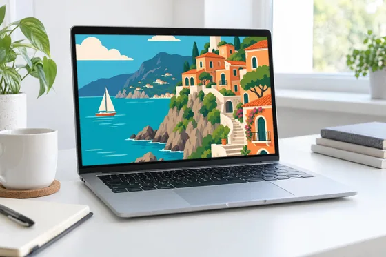
Make hero images, illustrations and banners in any aspect ratio.
Turn a product shot into a short clip for the landing page.
Turn a product photo into a 3D model for an interactive page.
$1 in free credits for eligible new accounts. No card needed. Generators have separate account and credit requirements. The Responsive tester is free.
Yes. No account, no limits on devices or pages, no watermark on screenshots and nothing to install: it runs in your browser.
Enter your site's address or paste your HTML, then pick from more than 40 phone, tablet, laptop and desktop sizes, one at a time or side by side. Drag a frame to any width, rotate it or jump to common breakpoints.
Each frame is a browser viewport of the exact width and height of that screen in CSS pixels, so your media queries, layouts and breakpoints respond just as they do on that device.
Yes. Paste your HTML or open an .html file to preview it at every size and edit it live. Websites load over https; for a local development server, use an https tunnel or paste the built HTML.
Yes. In your HTML it flags elements wider than the screen, the usual cause of sideways scrolling on phones, and warns when the viewport meta tag is missing.
Yes, for pasted HTML: save the visible area or the full page as a PNG at the device's pixel ratio, so a 393-pixel-wide frame at 3x gives a 1179-pixel-wide image.
Phones pack two to four physical pixels into each CSS pixel. The label shows that ratio, and screenshots of pasted HTML are saved at it, so they match the sharpness of the real screen.
No. A website is loaded straight from its own server by your browser, inside the frames, with no proxy in between. Pasted HTML and screenshots stay in your browser; your last page and settings are kept in this browser's storage.
Some sites choose not to be shown inside other pages. Open "Why is it blank?" to check the site's headers, or paste the page's HTML instead.
Paste your HTML or enter an address and compare phone, tablet and desktop side by side.
/filters:quality(82)/media/images/1791123751656780930_IfFPY7R0.webp)
/filters:quality(82)/media/images/1791123737177812425_RjKT3cku.webp)
/filters:quality(82)/media/images/1791123748309870128_xlkNgK8N.webp)
/filters:quality(82)/media/images/1791123738630744263_oR09R0aj.webp)
/filters:quality(82)/media/images/1791177033162457776_uQ09OY7g.webp)
/filters:quality(82)/media/images/1791123734319125607_JdnwGPY7.webp)
/filters:quality(82)/media/images/1791123746355630206_udnxGPY7.webp)
/filters:quality(82)/media/images/1791123744771362580_yC0sPezZ.webp)
/filters:quality(82)/media/images/1791123738606970169_5KIR1ais.webp)
/filters:quality(82)/media/images/1791123748197655725_EUmuFNW6.webp)