Lucid Origin by Leonardo AI creates high-fidelity, prompt-faithful, artistically diverse images with exceptional detail and refined definition. Ready-to-use REST inference API, best performance, no coldstarts, affordable pricing.
Idle
$0.02per run·~50 / $1
ExamplesView all
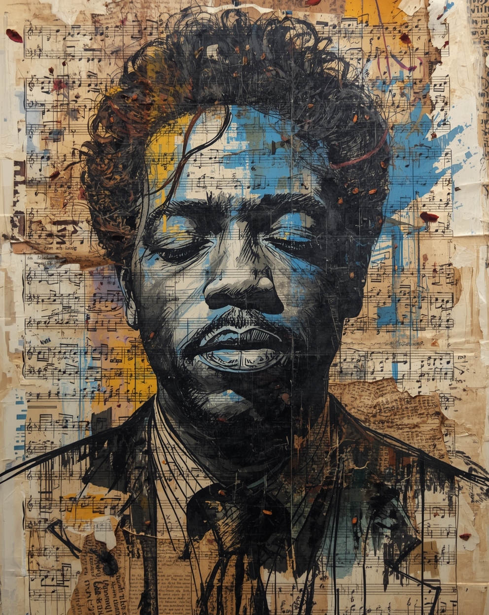
A soulful portrait of a jazz musician, created in a mixed-media collage style. The image is composed of torn sheet music, old newspaper clippings, dried flower petals, and burlap fabric. The musician's face is sketched with charcoal, overlaid with expressive splashes of acrylic paint. The overall feeling is chaotic yet passionate, full of creative and improvisational energy.
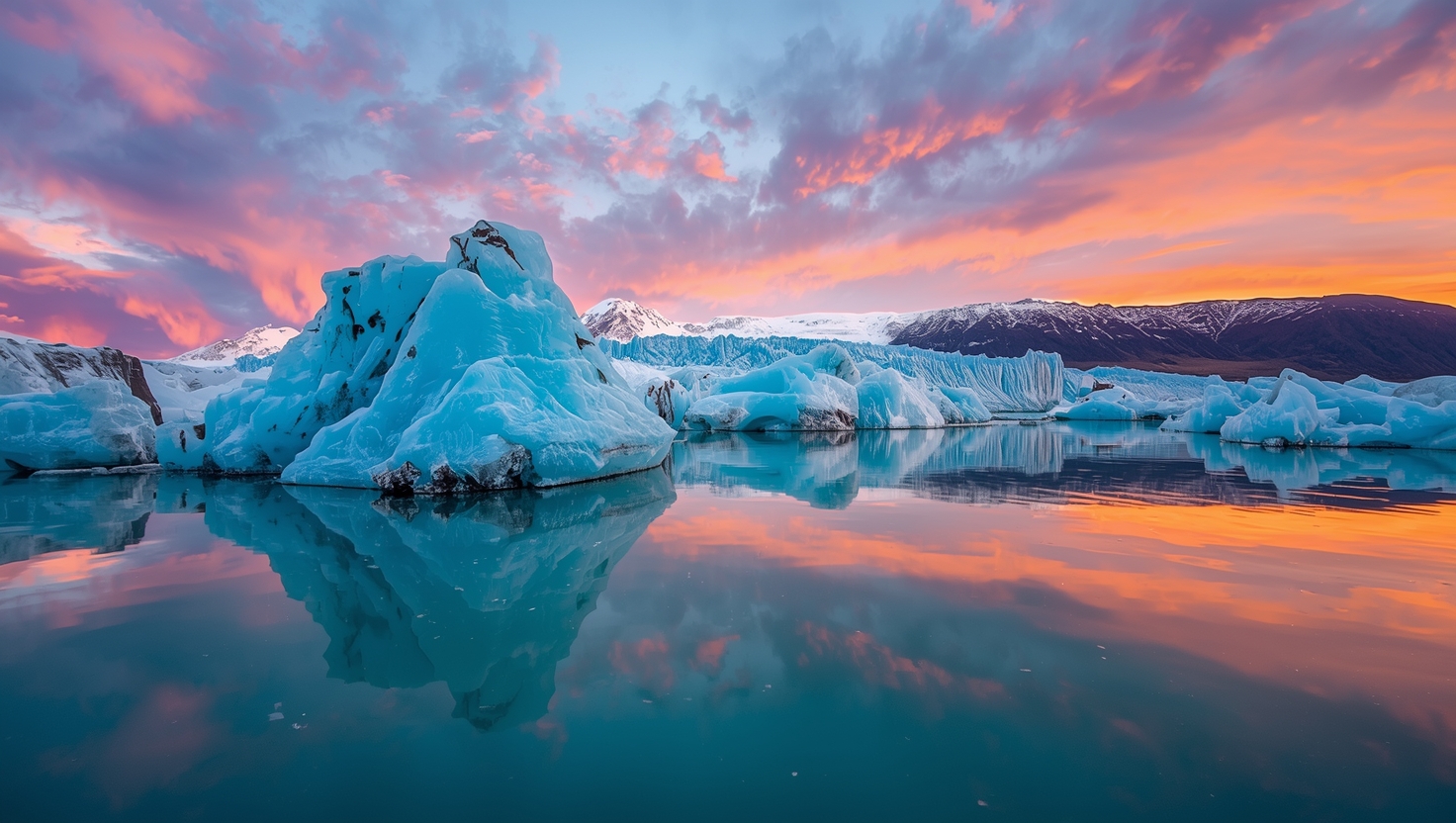
National Geographic style photography, epic wide-angle shot of Jökulsárlón glacier lagoon in Iceland at sunset. Giant blue icebergs floating on the calm water, reflecting the vibrant pink and orange clouds in the sky. Majestic glacier in the background. Crystal clear reflection, immense scale, serene atmosphere, ultra-detailed, HDR, Canon EOS R5.

surreal fantasy art of a giant whale made of translucent crystal, gracefully swimming through a sea of clouds under a tranquil starry sky. The whale's body glows softly with a galaxy nebula inside. Ethereal, dreamlike, magical, mysterious atmosphere, beautifully detailed, digital painting.
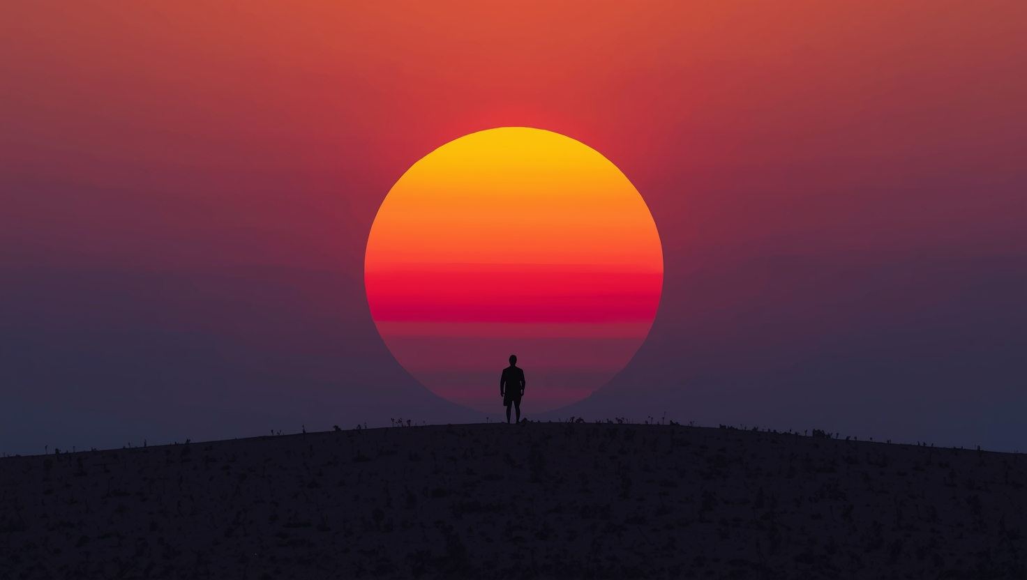
Minimalist and vast landscape, silhouette of a lone figure standing on a hill against a giant, vibrant setting sun. The sky is a gradient of orange and purple. Strong contrast, sense of solitude and wonder, clean composition, epic scale.
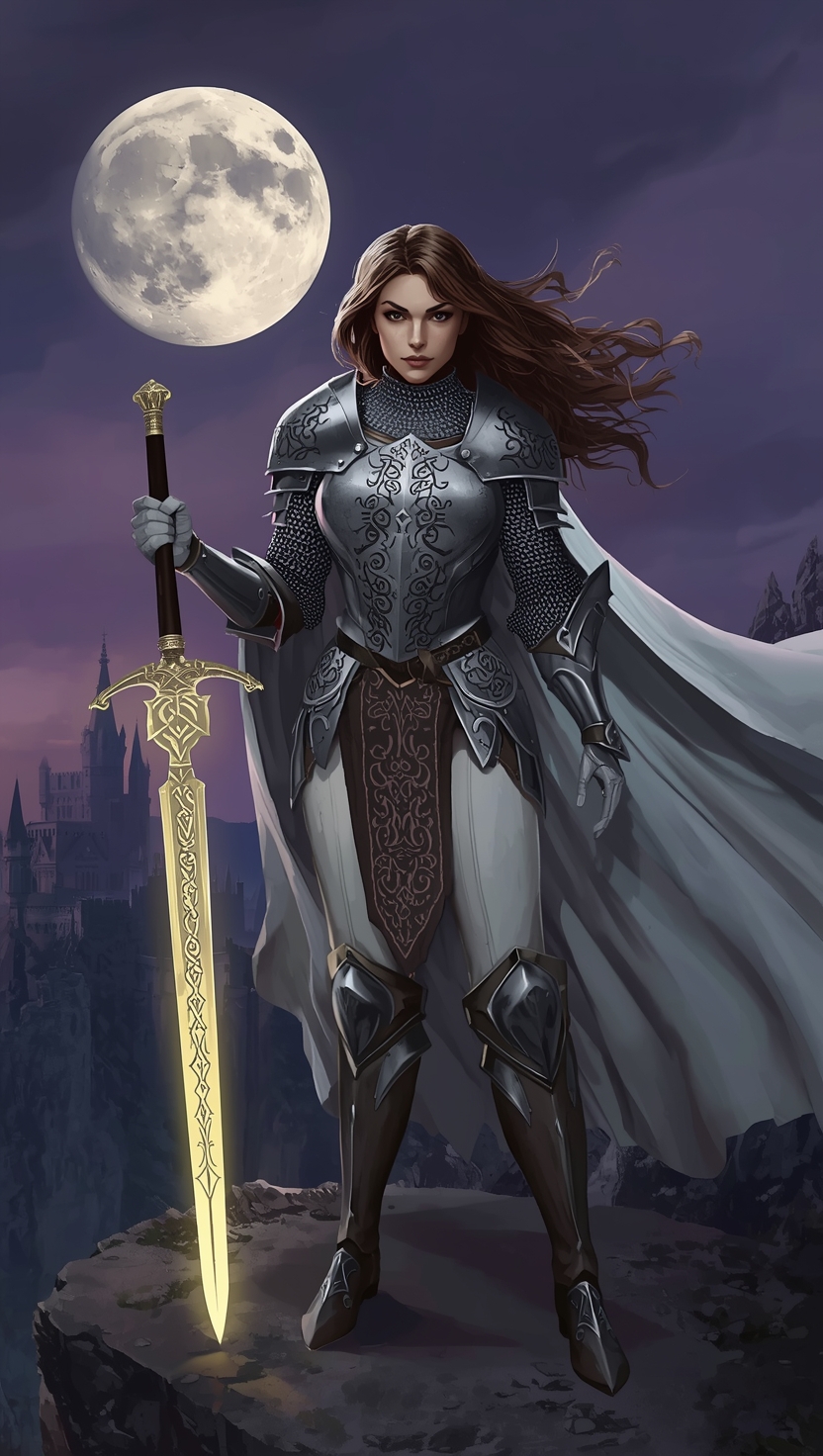
A female knight in intricate silver armor, standing on a cliff edge, holding a faintly glowing runic longsword, her white cape billowing in the wind. In the background, a giant twin moon hangs in the purple twilight sky over a distant gothic spire castle. Digital painting, concept art, in the style of Alphonse Mucha and Zdzisław Beksiński. Epic and mystical mood, strong chiaroscuro.
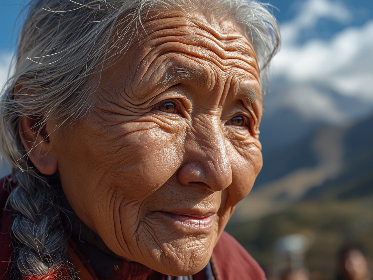
ultra realistic close-up portrait of an 80-year-old Tibetan woman, deep wrinkles on her weathered face, her eyes twinkling with wisdom and resilience. Dramatic side lighting from the sun, highlighting every skin texture detail and her silver hair. Shot on Sony a7 IV, 85mm f/1.4 lens, extremely shallow depth of field, blurred Himalayas in the background. photorealistic, National Geographic photography style, hyperdetailed, authentic skin texture.

A sun-drenched modern Japandi-style living room. Golden late-afternoon sunlight streams through a massive floor-to-ceiling window, creating long shadows on the floor. visible dust motes floating in the air. The room features natural oak floors, a beige linen sofa, and a rustic ceramic vase with a single dry branch. Minimalist, serene, and cozy atmosphere. Architectural Digest magazine photography, shot on a 35mm lens, clean and airy aesthetic.

Action shot of a basketball player frozen mid-air executing a powerful tomahawk dunk. Muscles taut, sweat droplets flying, an expression of intense focus on his face. Dramatic overhead stadium spotlights creating harsh highlights and shadows. The crowd in the background is treated with motion blur. Sports Illustrated cover photography style, high-shutter-speed effect, immense power and explosive energy.
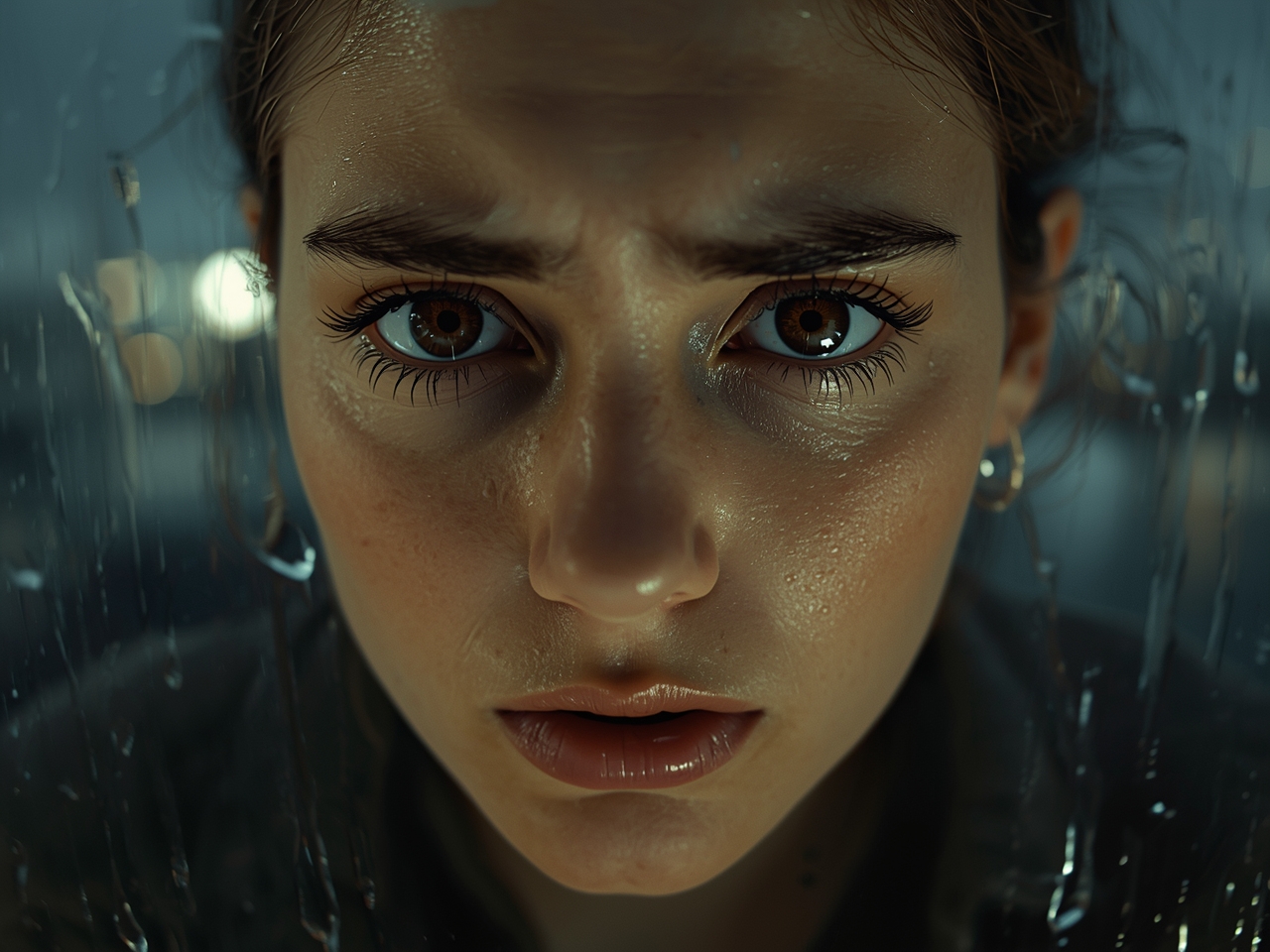
Close-up shot of a young woman's face, tears welling up in her large, expressive brown eyes. Her brow is furrowed with sadness and despair. Rain streaks down the windowpane behind her, blurring the city lights. Cinematic lighting, shallow depth of field, emotionally charged.
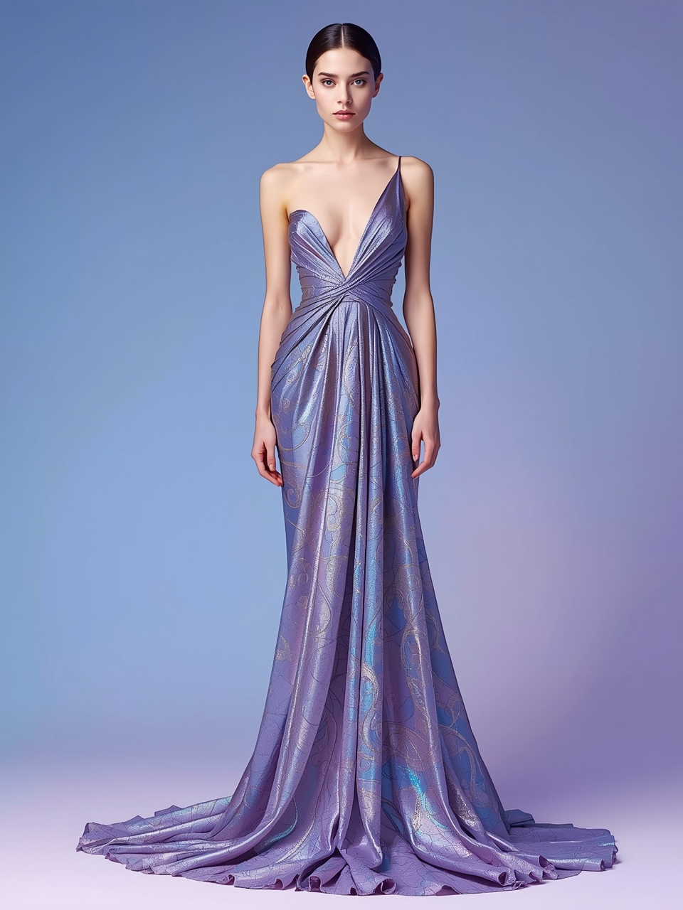
A model in an elegant pose, wearing a futuristic haute couture gown made of iridescent, flowing fabric. A stylistic fusion of Patrick Nagel's minimalist graphic aesthetic and Alphonse Mucha's art nouveau linework. Soft gradient background, minimalist composition, emphasizing the character's silhouette and the dress's design.
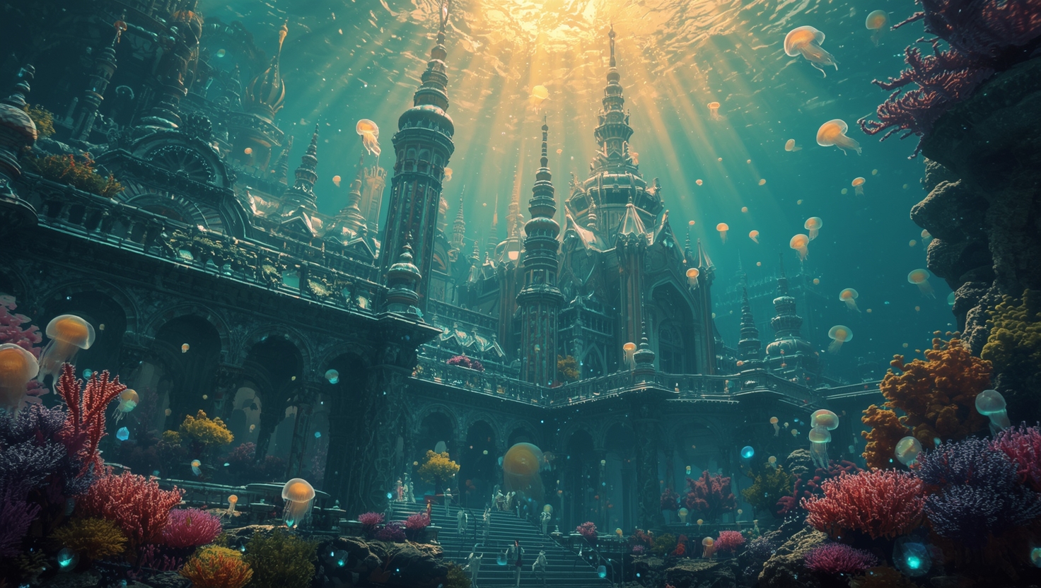
An epic underwater palace, its architecture an organic fusion of the Baroque style and a living coral reef. The spires and arches of the palace are made of iridescent mother-of-pearl and living coral formations. Gardens are composed of giant, colorful sea anemones. Swarms of bioluminescent jellyfish drift by like lanterns. Sunbeams penetrate the water's surface, creating dramatic god rays (Tyndall effect). Epic scale concept art, awe-inspiring and serene.
Related Models


README
Leonardo Lucid Origin
Versatile, vibrant, and design-savvy. Lucid Origin is Leonardo’s all-purpose text-to-image model built for rapid concepting, polished graphics, and lush color work—equally at home with photoreal scenes, stylized illustration, brand layouts, and product mockups.
Why it shines
- Ultimate style adaptability — Shifts from cinematic realism to hand-drawn charm, concept art, or graphic posters without heavy prompt gymnastics.
- Vibrant color & depth — Bold saturation, pleasing palettes, and strong visual layering that feel alive.
- Full-HD clarity — Crisp, high-definition outputs suitable for presentations, social, and print-friendly pipelines.
- Layout awareness — Naturally clean composition for posters, covers, UI/landing mockups, and deck visuals.
- Accurate text rendering — Generates legible labels, logos, and headings; far fewer garbled characters.
- Beginner-friendly, pro-ready — Fast “good first try” results for newcomers; reliable baseline for power users.
Price
Just $0.02 per image!!!
How to use
- Write a focused prompt: subject, setting, style (e.g., “flat graphic poster” vs. “cinematic”), color palette, lighting, mood.
- Pick aspect_ratio for destination (4:5 feed, 9:16 story, 16:9 slide).
- Generate → iterate: tweak style terms, palette words, or add “clean typography, balanced layout” for design tasks.
Prompt patterns (copy & adapt)
- Graphic poster: “Bold flat poster, high contrast teal–orange palette, centered headline ‘LUCID/ORIGIN’, clean sans-serif, grid-based layout, negative space, vector feel.”
- Cinematic realism: “Rainy street at blue hour, soft neon reflections, shallow depth of field, 35mm look, subtle grain, candid subject mid-stride.”
- Brand mockup (I2I): “Preserve packaging dieline from reference; restyle to minimal eco aesthetic—matte paper, muted greens, small serif headline, balanced margins.”
- Concept art: “Exploratory sci-fi rover on crimson dunes, painterly brushwork, dramatic scale, hero light from left, atmospheric haze.”
Pro tips
- For clean type, place short text in quotes, specify font vibe (sans/serif/condensed), and note placement (header/subhead/label).
- Use 2–3 style anchors max (e.g., “flat graphic, Swiss grid, high contrast”)—avoid conflicting art terms.
- Add palette cues (“muted earth tones,” “triadic palette,” “CMYK poster inks”) to steer color coherently.
- Reuse reference + seed to keep characters, props, or layout consistent across a campaign.
Common use cases
- Concept art
- Posters & key visuals
- Social/ads creatives
- Packaging & label comps
- UI/landing mockups
- Product hero shots
- Editorial illustration
Lucid Origin API — Quick start
Grab a WaveSpeedAI API key, then call POST https://api.wavespeed.ai/api/v3/leonardoai/lucid-origin with your input as JSON. The endpoint returns a prediction id; poll the prediction endpoint until status flips to completed, then read the output URL from data.outputs[0]. Examples for Lucid Origin below.
HTTP example
# Submit the prediction
curl -X POST "https://api.wavespeed.ai/api/v3/leonardoai/lucid-origin" \
  -H "Content-Type: application/json" \
  -H "Authorization: Bearer $WAVESPEED_API_KEY" \
  -d '{
    "prompt": "A cinematic shot of a city at sunset, soft golden light",
    "aspect_ratio": "16:9",
    "enable_sync_mode": false,
    "enable_base64_output": false
}'

# Response includes a prediction id. Poll for the result:
curl -X GET "https://api.wavespeed.ai/api/v3/predictions/{request_id}/result" \
  -H "Authorization: Bearer $WAVESPEED_API_KEY"

# When status is "completed", read the output from data.outputs[0].
Node.js example
// npm install wavespeed
const WaveSpeed = require('wavespeed');

const client = new WaveSpeed(); // reads WAVESPEED_API_KEY from env

const result = await client.run("leonardoai/lucid-origin", {
        "prompt": "A cinematic shot of a city at sunset, soft golden light",
        "aspect_ratio": "16:9",
        "enable_sync_mode": false,
        "enable_base64_output": false
});

console.log(result.outputs[0]); // → URL of the generated output
Python example
# pip install wavespeed
import wavespeed

output = wavespeed.run(
    "leonardoai/lucid-origin",
    {
    "prompt": "A cinematic shot of a city at sunset, soft golden light",
    "aspect_ratio": "16:9",
    "enable_sync_mode": false,
    "enable_base64_output": false
}
)

print(output["outputs"][0])  # → URL of the generated output
Lucid Origin API — Frequently asked questions
What is the Lucid Origin API?
Lucid Origin is a Leonardoai model for image generation, exposed as a REST API on WaveSpeedAI. Lucid Origin by Leonardo AI creates high-fidelity, prompt-faithful, artistically diverse images with exceptional detail and refined definition. Ready-to-use REST inference API, best performance, no coldstarts, affordable pricing. You can call it programmatically or try it from the playground above.
How do I call the Lucid Origin API?
POST your input parameters to the model's REST endpoint (shown in the API tab of this playground) with your WaveSpeedAI API key in the Authorization header. Submission returns a prediction ID; poll the prediction endpoint until status flips to "completed", then read the output URL from the result. The playground generates a ready-to-paste code sample in Python, JavaScript, or cURL for whatever inputs you've set. Full request/response shape is documented at https://wavespeed.ai/docs/docs-api/leonardoai/leonardoai-lucid-origin.
How much does Lucid Origin cost per run?
Lucid Origin starts at $0.020 per run. That figure is the base price — the final charge scales with the parameters you set in the form (output size, length, count, references, or whatever knobs this model exposes), so a higher-quality or larger output costs more than a minimal one. The exact cost for your current input is shown live next to the Generate button before you submit, and the actual per-call charge is recorded on the prediction afterwards.
What inputs does Lucid Origin accept?
Key inputs: `prompt`, `aspect_ratio`, `enable_base64_output`, `enable_sync_mode`. The full JSON schema (types, defaults, allowed values) is rendered above the Generate button and mirrored in the API reference at https://wavespeed.ai/docs/docs-api/leonardoai/leonardoai-lucid-origin.
How long does Lucid Origin take to generate?
Average end-to-end generation time on WaveSpeedAI is around 6 seconds per request — measured across recent runs. Queue time scales with global demand; live status is visible in the prediction record.
Can I use Lucid Origin outputs commercially?
Commercial usage rights depend on the model's license, set by its provider (Leonardoai). The license summary appears on the model card above; see WaveSpeedAI's Terms of Service for platform-level conditions.