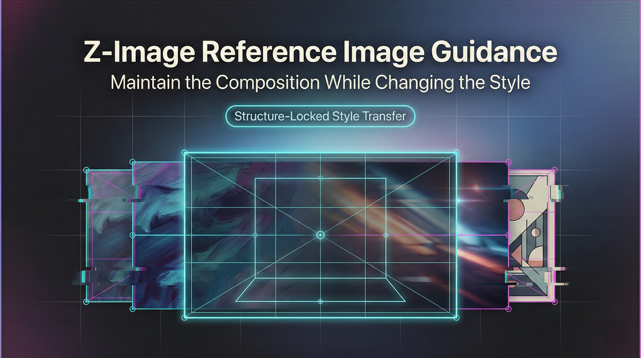
Z-Image Reference Image Guidance: Maintain the composition while changing the style
Hey, I’m Dora. Do you know? I’d generate a great visual once, then fail to match it again later. Same prompt, slightly different need, totally different vibe. I wanted a steadier handle, not a template, just some guardrails.
That’s when I spent a week leaning on Z-Image reference image guidance. Not because it’s flashy, but because it promised something simple: keep what matters from a seed image while letting the model explore. Below are the notes I wish I had at the start, how it actually feels, where it slips, and the quiet settings that pulled the most weight.
What is Reference Image Guidance
Reference image guidance (sometimes called img2img conditioning or reference conditioning) lets you feed a model a real image alongside your text prompt. The model uses that input image as an anchor: style, composition, color palette, or structure, depending on how you set the dials, while still listening to your words.
In practice, I treat the Z-Image reference image as a “tone setter.” I don’t ask it to do everything. I use it to reduce variance where I care (pose, palette, layout) and let the prompt handle the rest.
Difference from Pure Image-to-Text Generation
I ran the same prompt two ways, once with no image, once with a reference. Without the image, I got a fun spread of results: some moody, some flat, a few unusable. When I added a reference image (a simple desk scene I shot on my phone), the model kept the desk layout, the soft daylight, even the wood grain feel, while still swapping the objects I asked for. It didn’t feel “locked.” It felt politely constrained.
Pure text is great for exploration. But when you need repeatability (campaign variants, product angles, slide visuals), the reference image trims randomness. My mental load dropped the most here: fewer restarts, fewer prompt contortions.
Scope of Influence of Reference Image
The reference can influence different layers:
- Global composition: camera angle, subject placement, negative space.
- Style cues: lighting, texture density, color temperature.
- Local structure: silhouette, pose, product outline.
What surprised me: the reference image’s influence shows up even when I don’t describe those details in text. If your reference has harsh top light, your outputs may inherit that unless you counterbalance in the prompt (e.g., “soft side lighting, muted highlights”).
Detailed Explanation of the “Strength” Parameter
Different systems name it differently (strength, fidelity, guidance scale for image, etc.). The meaning is similar: lower values cling to the reference: higher values loosen the grip. If you’re also tuning text influence, this breakdown of Z-Image CFG best settings pairs well with strength adjustments.
Below is how these ranges behaved for me across about 60 generations. Your mileage may vary, models differ, but the shape of the curve tends to hold.
0.2–0.4: Strong Reference Guidance (Maintain Original Image)
At 0.2–0.4, the Z-Image reference image acts like wet cement. The model keeps composition, lighting, and even small textures. If I change text like “swap notebook for a tablet,” it’ll usually do it, but the tablet ends up exactly where the notebook was. Great for:
- Product color swaps
- Minor prop changes
- Label or packaging refreshes
Friction: artifacts creep in if the text asks for structural changes the reference can’t support. Example: turning a closed laptop into an open one in the same pose gave me bent geometry at 0.3. When I hit this wall, I either nudge strength up or switch the reference to one with a compatible pose.
0.4–0.6: Balanced Area
This was my daily driver. At 0.5, the model keeps the scene’s bones but rewrites the details with less struggle. Composition holds: objects can move a little: lighting can soften or warm. It’s enough consistency for a set of related images without everything feeling cloned.
What helped: stating what to keep. I got cleaner results with prompts like “keep the desk angle and daylight: replace mug with glass tumbler: add plant, shallow depth of field.” The combo of mid strength + explicit keepers beat vague adjectives.
0.6–0.8: Weak Guidance (More Creative)
Here, the reference becomes suggestion, not rule. The model freely shifts camera angle, adds or removes elements, and sometimes updates style. I used 0.7 for mood-board expansion: same vibe, new rooms. About 30–40% of outputs still nodded to the original palette.
Caveat: this range is more likely to misread small product features (ports, stitching patterns) unless you reinforce them in text or supply a higher-res reference. I caught odd seams on bags and wrong bevels on devices. Fixable, but worth checking.
0.8–1.0: Almost Ignore Reference Image
Above ~0.8, I treat the reference as a hint from a previous meeting. It may recognize colors or a rough silhouette, but not much else. Sometimes that’s enough: if all I want is “keep it warm and wood-forward,” 0.85 gets me there while inviting new angles.
But for production work, I don’t stay here long. It’s closer to pure text generation with a tiny nudge. When I end up at 0.9, it’s because I chose the wrong reference for the job and I’m trying to wring out only the palette. Usually better to pick a better reference and drop back to 0.5.
API Implementation
I tested API calls using a simple requests setup and a small wrapper. I prefer starting from raw HTTP because it shows what’s actually required, and what’s optional noise.
If you’re new to reference conditioning, it’s worth scanning provider docs for how they define strength and what defaults they use. For background on similar workflows, I found the Hugging Face Diffusers guides on image-to-image and ControlNet helpful. The names differ, the idea is the same.
Method of Passing “image” Parameter
In most APIs I tried, the reference image can be passed as one of:
- A public URL (fastest to prototype, watch for compression)
- A base64-encoded data URI (reliable, a bit verbose)
- Multipart upload (good for local files, keeps EXIF/quality under your control)
I usually send PNG or high-quality JPEG around 1024 px on the long edge. Too small, and details wash out: too big, and you pay for bandwidth without better results. If the A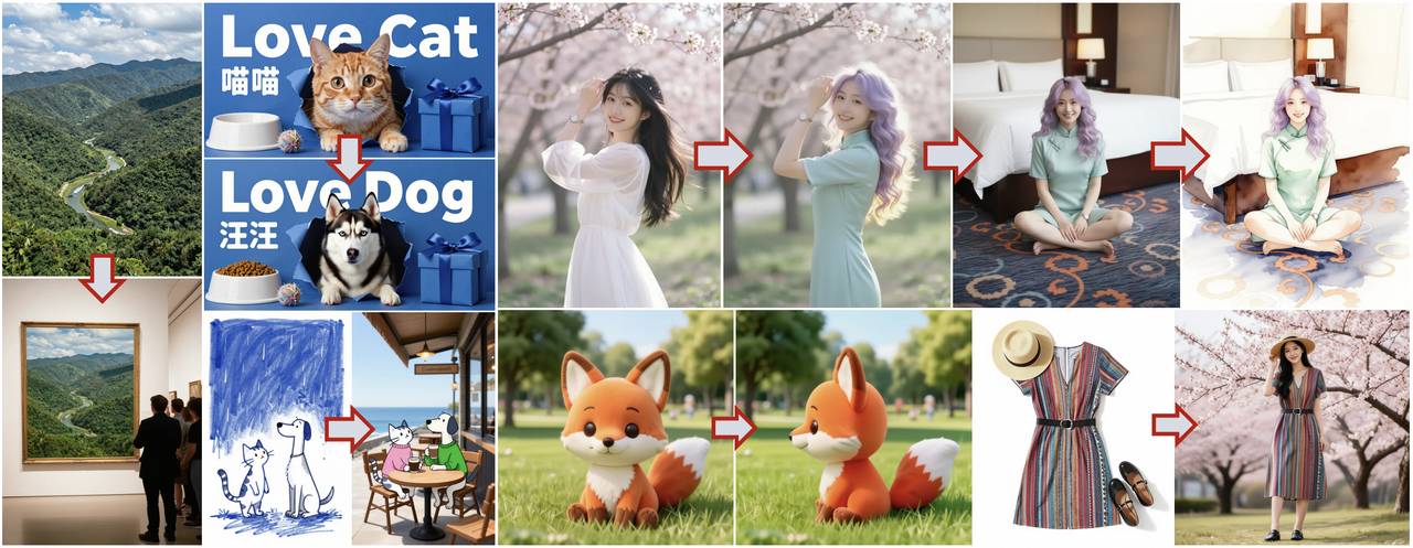 PI supports multiple reference images, start with one. Layering too many at once can cancel out the signal.
Python Code Example
Here’s a minimal pattern I used. It’s intentionally plain so you can adapt it. Replace the endpoint and key with your provider’s.
暂时无法在飞书文档外展示此内容
Practical Application Scenarios
Style Transfer
I used a clean product shot as the reference and asked for “studio portrait in the style of soft film, halation, gentle falloff.” At 0.45, the model kept the product’s silhouette and turned the lighting cinematic without warping edges. When I pushed down to 0.25, it clung to the original studio glare, nice, but less stylized. If you want bolder style, move toward 0.6 and reinforce with 2–3 specific style cues. More than that becomes noise.
Product Image Variants
For a landing page refresh, I needed eight angles that felt like siblings, not clones. I shot one tidy setup and used it as the Z-Image reference image for all prompts. Strength at 0.5 gave me consistent grain and white balance across shots while letting me rotate the object, add a hand, or swap a background prop. Time saved wasn’t huge per image (maybe two minutes), but the mental relief of avoiding “why is this one so different?” was real.
Conceptual Diagram Refinement
Diagrams are where reference guidance quietly shines. I sketched a layout in Figma, boxes, arrows, loose labels, exported a PNG, and used that as the reference. With strength at 0.4, I could describe the style (“minimal, soft gray lines, light accent color”) and the model preserved the structure. It removed a round of back-and-forth editing. If a label misaligned, I nudged the original Figma file and re-ran instead of wrestling with the prompt.
Best Practices
- Start with a clean reference. Straighten, remove clutter, and normalize exposure. The model copies more than you think.
- Choose strength for the job. 0.5 is a safe first stop: move down for fidelity, up for exploration.
- Tell it what to keep. Short, explicit keepers (“keep angle and palette”) reduce drift.
- Match resolution to need. Around 1024 px long edge is a pragmatic default for most APIs.
- Iterate in small steps. Change one thing at a time (prompt tweak or strength) so you can see cause and effect.
- Set a seed while tuning. Drop it later for variety.
- Watch for compounding bias. If you keep reusing an output as the next reference, style can calcify. Return to your original or a neutral base now and then.
- For teams, save the trifecta: reference image, prompt text, and numeric strength. Future-you will thank past-you.
If you’re surrounded by tools that promise magic, this is the quieter kind. It won’t do your taste-making. It just steadies your hand. I noticed that on a late afternoon run: same desk, same light, fewer second guesses. Not a big moment, but it stuck.
Related Articles
Seedance 2.0 Best Settings Guide: Duration, Aspect Ratio, “Quality vs Speed” Tradeoffs
Introducing Alibaba WAN 2.6 Image-to-Video Spicy on WaveSpeedAI
Introducing Alibaba WAN 2.6 Video Extend on WaveSpeedAI
Introducing ByteDance Seedance V1.5 Pro Image-to-Video Spicy on WaveSpeedAI
Introducing ByteDance Seedream V5.0 Lite Edit Sequential on WaveSpeedAI