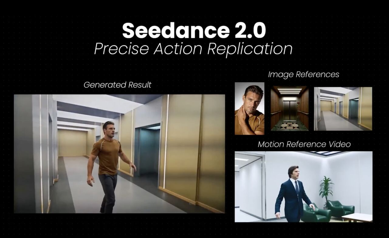
Seedance 2.0 Best Settings Guide: Duration, Aspect Ratio, “Quality vs Speed” Tradeoffs
Seedance 2.0 kept showing up in my notes, mostly because I liked how it handled motion without turning everything to soup. So, over the last few weeks, I sat down and ran the same prompts through it again and again, changing one thing at a time. Not to chase perfection, just to see which settings move the needle, and which are noise.
I’m Dora. Here’s what actually mattered for me, where presets help, and how I now run a simple “settings sweep” before I blame the model. If your days feel crowded and you want sane defaults, this might save you a few loops.
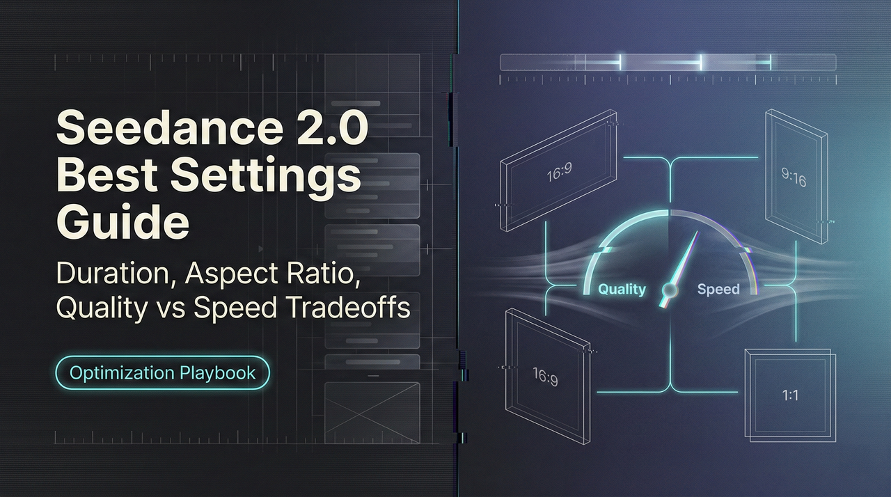
Settings that matter most (duration, aspect ratio, quality/speed)
I tried every toggle I could find, but three settings shaped 80% of my outcomes: duration, aspect ratio**, and where you land on the quality/speed dial**. Everything else felt like seasoning.
Duration
- What I noticed: Longer clips increased drift. Characters wandered off-model, colors shifted, and small continuity errors crept in. At 6–8 seconds, results stayed on-theme. Past 12 seconds, I started seeing costume changes mid-shot.
- Why it matters: The model has to “remember” your scene. The longer you ask it to remember without new guidance, the more it invents. Shorter shots let you reset intent.
- What I do now: I cap most first passes at 6–8 seconds. If I need a 20-second result, I break it into 3 shots and stitch. It’s not glamorous, but it’s reliable.
Aspect ratio
- What I noticed: Changing aspect ratio changed composition and emphasis more than I expected. 9:16 pulled faces and text forward: 16:9 gave more context but made small details brittle. 1:1 felt balanced, but only if I wasn’t trying to squeeze text.
- Why it matters: Framing pressures the model. A tall frame invites vertical motion (hands, steps, push-ins). A wide frame pulls in lateral motion and background detail, which raises the chance of artifacts.
- What I do now: I pick the ratio first, then prompt. If it’s vertical, I write for a single strong subject. If it’s 16:9, I give background direction in the prompt (“minimal background movement,” “soft depth,” or a simple “clean wall” anchor). It sounds basic, but it prevents crowded frames that fall apart.
Quality vs. speed
- What I noticed: The “fast” end is good enough for layout and timing checks. The “quality” end stabilizes textures and faces, but not evenly. It solidifies some things and exaggerates others (like lighting flicker) if your prompt is vague.
- Why it matters: Seedance 2.0 delivers up to 1080p output and can support native 2K resolution in some tiers. Upscaling quality without tightening intent often makes the mess sharper. Also, the render time curve isn’t linear. Going from medium to high quality costs more time than expected, and it only pays off when your scene is already coherent.
- What I do now: I draft at speed, lock the look with a reference frame (even a rough one), and only then bump quality. If the first two seconds wobble, I fix that at low/medium. Moving up too soon just hardens the wobble.
Presets by scenario (shorts, ads, cinematic, UGC)
Presets in Seedance 2.0 are helpful, but only if you treat them like starting stances, not rules. I cycled through four common scenarios and took notes on where each preset bent or broke.
For “shorts,” I care about pace and legibility on a small screen. For “ads,” I care about brand texture and repeatability. For “cinematic,” it’s motion and light. For “UGC,” it’s the illusion of handheld without nausea.
Shorts preset
What worked
- The vertical framing plus tighter motion bias kept subjects centered and recognizable. Text overlays stayed readable, which I didn’t expect on the first pass.
- Shorter default duration encouraged punchy cuts. I felt less tempted to cram multiple ideas into one clip, a trap I fall into.
Where it rubbed
- The default pacing can feel breathless. If you also ask for camera movement, it compounds. I turned off extra camera moves and used natural action instead (a look, a hand, a step). Fewer moving parts: cleaner result.
- High-contrast color grading looked good on my monitor but harsh on a phone. I nudged it to softer contrast, then tested on an actual device. This removed that crunchy halo around edges.
Practical tweak
- Keep it at 6–7 seconds, 9:16. Use medium quality for layout: high only after your first frame feels right. If there’s text, specify max two lines and a safe area. It reduced retakes for me.
Ads preset
What worked
- The preset seemed weighted toward steadier lighting and fabric/texture stability. When I ran the same product spin three times, the color stayed closer than with other presets.
- The tone didn’t fight me when I asked for “clean backdrop” or “single key light.” It respected simple constraints.
Where it rubbed
- Overly slick by default. If you want human hands or lived-in spaces, you must say it. Otherwise, it leans into showroom vibes that feel sterile on social.
- Longer durations (10+ seconds) increased micro-artifacts on edges of the product, especially with reflective surfaces. Breaking the shot into a hero angle + cutaway helped.
Practical tweak
- 1:1 or 4:5 often beats 16:9 for product detail on feed. Lock seed after your first decent pass, then iterate on lighting language (“soft bounce,” “no specular hotspots”). For logos, keep the motion simple: complex moves invited jitter.
Cinematic (how I used it)
- I got the best motion from this preset, but only with clear verbs: “slow dolly-in,” “over-the-shoulder,” “static wide.” Vague terms like “cinematic shot” gave me moody chaos.
- If you want subtle natural light, mention time-of-day and one surface (“late afternoon window light on wood table”). It cut the flicker. If flicker persists, shorten the shot. I’ve also found this practical guide on fixing flicker and jitter in Seedance 2.0 helpful when instability keeps creeping back between renders.
UGC (how I used it)
- The handheld bias is believable at short durations. Past 8 seconds, it tilts into jitter. I dialed down camera shake in the prompt and asked for “single subject, chest-up.”
- Clothing patterns and hair hold up better here than I expected, but only if the background is simple. Busy rooms multiply artifacts. I wrote in “neutral background, no fast background motion” and it helped.
Across all presets, the same rule kept paying off: commit to the aspect ratio and duration before you touch anything fancy. Presets won’t save a confused frame.
A simple “settings sweep” test (change 1 variable per run)
When a clip goes sideways, I do a five-run sweep. It’s dull, and it works. One variable per run, same seed, same prompt, same reference if I’m using one. I timebox the whole thing to ~20 minutes.
My sweep
- Duration check
- Run A: 6s
- Run B: 10s
- Watch for drift in faces, props, and lighting shifts. If 6s is cleaner, I plan for multi-shot.
- Ratio check
- Run C: same as A but in the target aspect ratio. If I’m moving from 9:16 to 16:9, I rewrite one line to control background. Even a single phrase (“plain wall”) matters more than another adjective.
- Quality check
- Run D: bump to high quality. If flaws get sharper, I know it’s not a quality problem, it’s intent or duration.
- Guidance/seed check
- Run E: keep quality high, lock seed, nudge guidance strength up a notch if colors are slipping: down a notch if motion feels stiff. If both ends fail, I revert to medium guidance and refresh the seed once.
What changed for me
- This didn’t save me time at first. But after a few cycles, it cut my mental load. I stopped thrashing between ten toggles and started seeing patterns. In practice, I now need one fewer revision per clip, sometimes two. That’s the kind of quiet win I care about.
Decision rules (when settings won’t fix drift/artifacts)
Sometimes the model just drifts. No setting will pull it back enough to trust the take. I keep a few rules to decide when to stop tweaking.
- If the first two seconds wobble, restart the shot. Early instability rarely settles later. I trim scope (shorter duration, fewer moving parts) and rewrite the opening beat.
- If faces or logos change shape between frames, split the scene. Trying to brute-force stability with quality usually makes the uncanny valley crisper.
- If lighting flickers, anchor it in the prompt with one source and one surface (“single soft key from left on matte wall”). If that fails, shorten the clip or change the angle. Flicker is often a composition issue, not a slider issue.
- If hands keep breaking, avoid complex gestures and cut around them. Ask for “hands at rest,” then insert a separate close-up if you must show an action.
- If color drifts across takes even though a locked seed, refresh the seed and add a color anchor (“muted palette,” or a specific hex if the tool accepts it). If you’re matching brand color, isolate that color in a simpler background.
When I step back, the pattern is simple: shots that read cleanly in stills tend to hold up in motion. If a single frame is confusing, the video will amplify that confusion.
This isn’t a critique of* Seedance 2.0, it’s how most generative video behaves today. The upside is predictable: shorter, clearer shots, picked with care, look better than one long “ambitious” take. And they’re easier to fix.
Related Articles
Z-Image Reference Image Guidance: Maintain the composition while changing the style
Introducing Alibaba WAN 2.6 Image-to-Video Spicy on WaveSpeedAI
Introducing Alibaba WAN 2.6 Video Extend on WaveSpeedAI
Introducing ByteDance Seedance V1.5 Pro Image-to-Video Spicy on WaveSpeedAI
Introducing ByteDance Seedream V5.0 Lite Edit Sequential on WaveSpeedAI