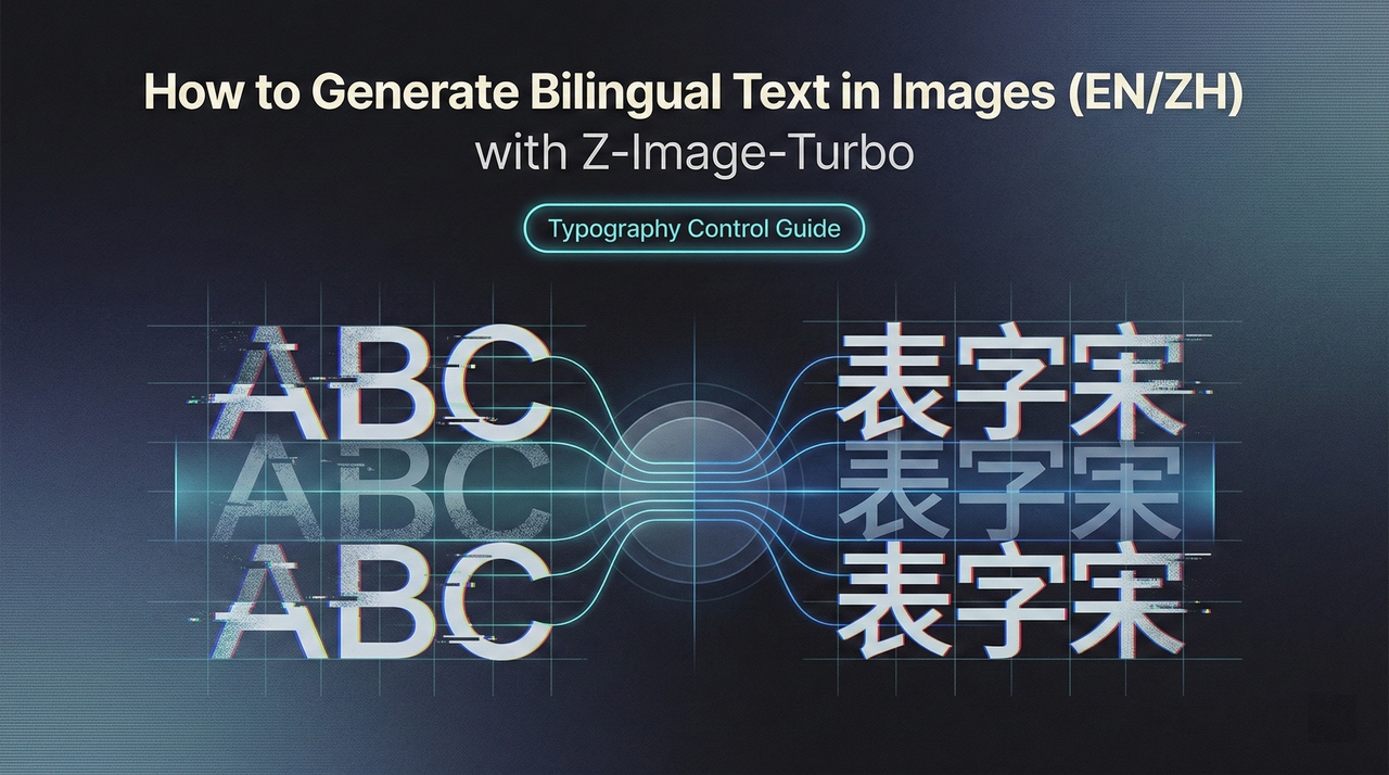
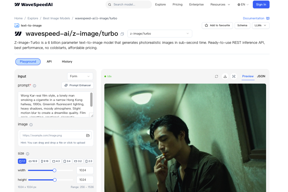
How to Generate Bilingual Text in Images (EN/ZH) with Z-Image-Turbo
Hey, I’m Dora. This week, I needed a clean product mockup with a tiny bilingual label, two words in English, two in Chinese, and I didn’t want to open Figma for the fifth time that morning. So I tried Z-Image-Turbo again. I’d used it for fast concept shots before, but I was curious: could it place real, readable EN/ZH text into an image without turning letters into soup?
Short answer: often, yes. Not always. But when it hits, it saves a surprising amount of mental load. Below are my notes from a handful of sessions, what consistently worked for me, where it stumbled, and the prompts that made a difference when you want to generate bilingual text in images with Z-Image-Turbo.
Z-Image-Turbo’s Text Rendering Capability
Bilingual Prompt Understanding
What I noticed first: I didn’t have to over-explain the language mix. Z-Image-Turbo understands prompts in English and Chinese, and can render multilingual text directly in the image. If I wrote a single prompt with both English and Chinese phrases in quotes, like “CALM TEA” and “静茶”, Z-Image-Turbo tended to honor both. It seemed to treat each phrase as a unit, not as random characters. When I included a short parenthetical note like (English + Simplified Chinese), hits improved a bit. I don’t mean a dramatic jump, just enough to feel less lucky.
In practice, I saw fewer garbled strokes when I kept Chinese strings short and common. Everyday words held up better than poetic lines or rare characters. Punctuation also mattered: full-width punctuation sometimes nudged the model off course. Plain quotes worked better than fancy ones.
Native EN/ZH Text in Images
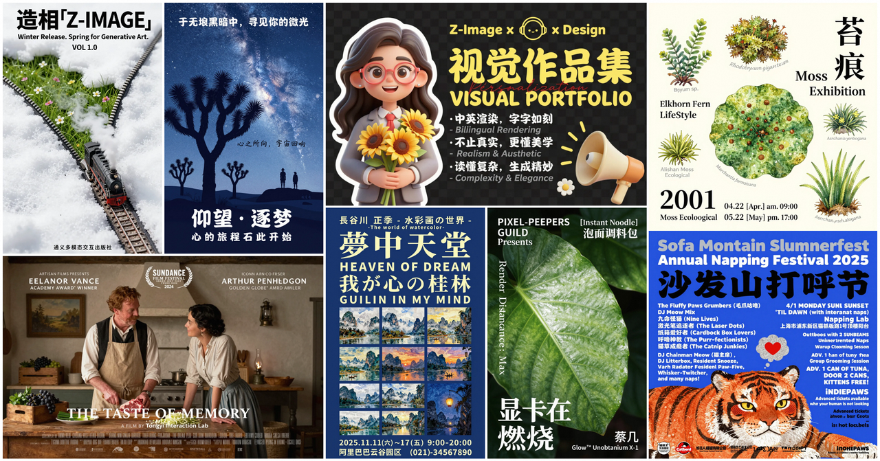
When it works, the text looks native to the image. I tested product labels, posters, and social graphics. English stayed crisp more often than Chinese, but Z-Image-Turbo handled many common Chinese characters cleanly at small-to-medium sizes. With mixed EN/ZH in one frame, I got readable output about 7 out of 10 times on short phrases. That’s not a universal truth, it’s what I saw across ~30 renders. I kept seed and composition steady and only changed text, which made the wins feel deliberate, not accidental.
The nicest part is placement. The model doesn’t just paste text: it tries to compose it. On a tea tin, it curved the label slightly to match the can’s surface. On a banner, it respected left-to-right and top-to-bottom flow. This isn’t perfect. Edges can blur, and kerning can drift. But for quick concepting or social posts, the native look often passes a casual glance without a second thought.
When Text Rendering Works Best
Short Text (1–5 Words)
Short phrases are the sweet spot. One to five words per language worked best for me. A simple pair like “CALM TEA” and “静茶” held up far better than a sentence. As the character count grows, the odds of drift rise, missing radicals, swapped order, or that uncanny almost-right feeling that still reads wrong. Keeping it short didn’t always save time, but it reduced retries.
Common Typography Styles
I had better luck with clean sans-serif or simple display faces. When I asked for high-contrast Didone or textured brush scripts, the model took creative liberties, beautiful, sometimes, but less legible. If your goal is clarity, aim for: bold sans, geometric sans, or minimal grotesque. Serif is workable if you ask for “legible serif” and keep sizes larger. For Chinese, sans with even stroke weights was usually safest.
Poster and Banner Layouts
Flat, graphic layouts encourage good text. Z-Image-Turbo seems happiest when it can treat type like a major shape. Posters, banners, hero images, these helped it nail alignment and contrast. If I tried to overlay small bilingual captions on busy photos, it stumbled more. When I mocked a poster with blocks of color and asked for EN in the headline and ZH as a subhead, both stayed readable more often than in a noisy scene.
Prompting for Text
Explicit Text Instructions
Being literal helped. I format the prompt with explicit quotes and roles:
- headline: “CALM TEA”
- subhead (Simplified Chinese): “静茶”
- include both lines as actual text, not decorative shapes
I also add: bilingual text (English + Simplified Chinese), accurate spelling. If the model drifted, I nudged with: preserve exact characters. It’s not magic, but it trims the guesswork.
I keep the rest of the prompt lean: a short style phrase, base colors, and the surface or format (poster, label, banner). The more I stuffed in, ambience, metaphors, extra objects, the more the letters suffered.
Specifying Font Style
I don’t name real fonts: I describe traits: “bold sans-serif, even stroke, high legibility” or “minimal serif, generous letterspacing”. For Chinese, I add “clean sans Chinese type, balanced strokes”. If the output looks too artsy, I add: avoid distorted or abstract glyphs. One small note: spacing terms help, tight tracking for headlines, normal tracking for labels. Kerning isn’t always honored, but those hints steer it.
Positioning Text in Scene
I got steadier results when I reserved space for type. Phrases like: centered headline area: top-left badge: label panel on the front of a tin. For curved surfaces, I add: wrap text to surface, maintain legibility. And if contrast slipped, a quick follow-up prompt with: increase contrast between text and background usually fixed it on the next render.
If placement really matters, I’ll include layout cues: A/B blocks, a quiet margin, or “grid-based layout.” It sounds fussy, but it cut my retries from five to two on some banners.
Practical Examples

Product Labels (EN + ZH)
I mocked a tea tin label with two lines: EN on top, ZH below. Prompt bits that mattered: front-facing cylindrical tin, matte label panel, bold sans English headline “CALM TEA”, Simplified Chinese subhead “静茶”, high contrast, preserve exact characters. On three runs, two were clean enough to ship as concept art. The third swapped the second character, close, but wrong. A quick re-run with preserve exact characters fixed it.
On bottles with gloss, reflections sometimes muddied the strokes. Asking for matte label or soft diffused light helped.
Social Media Graphics
For square posts, I kept text to a headline in EN and a small ZH tag. One prompt that worked: minimalist poster style, centered grid, headline “FOCUS”, Simplified Chinese tag “专注”, bold sans, high legibility, no decorative distortion. I usually got readable output in 1–2 tries. When I pushed for gradients or textured backgrounds, the text started to blend in. Adding: solid color block behind text or clear margin brought it back.
I timed a batch of six variations. With a steady seed, I produced an acceptable set in about 15 minutes, where Figma would’ve taken me 25–30 with font hunting. Not a huge time win, but lighter on the brain.
Marketing Banners
Wider canvases favored bilingual lines side-by-side: EN left, ZH right. Short calls-to-action like “START HERE” / “从这里开始” worked fine at medium size. If I asked for tiny footer fine print, fidelity dropped fast. My fallback: generate the hero text in-model, then add the legal copy in a design tool. That split kept the banner visually coherent while respecting the hard part, actual legibility at small sizes.
Limitations & Workarounds
Long Text Challenges
Anything beyond five words per line raises the failure chance, especially in Chinese. Strokes merge, or one character takes artistic leave. If I must include a phrase, I break it: two short lines, each validated on separate runs. I also avoid unusual punctuation and rare glyphs unless I’m ready for multiple retries.
When to Add Text Post-Generation
I draw a line based on stakes. If it’s a concept or a social post where the vibe matters more than letter-perfect fidelity, I let Z-Image-Turbo render the text. If it’s packaging, UI, or anything legally sensitive, I add text after generation. The model gives me composition and mood: my design tool gives me control and certainty. It’s a calm split of labor that saves me from pixel-level frustration.
Combining with Inpainting
When the layout is right but the text is off by a character, inpainting helps. If you haven’t tried it yet, this short Z-Image-Turbo inpaint guide walks through masking and re-prompting strategies that make text fixes much cleaner.
I define a small mask over the faulty word and re-prompt with the exact string in quotes, plus preserve exact characters, high legibility. Keeping the mask tight and the background simple preserves texture while fixing the glyphs. On posters, this rescued about half of my near-misses without redoing the whole image.
One last note: I treat each win as local, not global. Different scenes and lighting change the odds. If you’re trying to generate bilingual text in images (EN/ZH) with Z-Image-Turbo for the first time, start with short words, simple type, and a clean layout. If it behaves, stretch a little. If it resists, don’t wrestle, add the text after. Either way, the work feels lighter.
I still catch myself squinting at a curve or a radical, checking if it’s really there. Most days, that tiny pause is worth it.
Related Articles
Introducing Bria Embed Product on WaveSpeedAI
Introducing Google Nano Banana 2 Edit Fast on WaveSpeedAI