Z-Image Negative Prompt Resource Package: Over 50 ready-to-copy templates
Do you, like me, always encounter the same minor issues during the process of generating images: the skin appears very oily, the edges are processed too sharply, and the background part looks like a scene from an old auction.
I’m Dora. Across January–February 2026, I ran a set of quiet tests in Z-Image-Base and a few adjacent pipelines. Nothing fancy: same prompts, small batches, light tweaks. I saved what reduced cleanup and mental load. This is the Z-Image negative prompt resource package: 50+ small exclusions that, together, make the model less chaotic and more usable.
I’ll walk through why negative prompts work, then share the general templates and the sets I keep for portraits, product shots, and illustration. No hype, just what held up in day-to-day work.
The Basic Principles of Negative Prompt
Why Negative Prompt Works
Negative prompts don’t “fix” the model. They set guardrails. In practice, you’re telling the sampler: if a token tries to steer the image this way, lean away. When it’s done right, I see fewer spurious details and less corrective editing later.
A few things I noticed in testing:
- They reduce mental effort more than wall-clock time. My average post-edit steps dropped from ~8 to ~3 on portrait batches.
- They work best when they’re specific to the failure you keep seeing. Generic “bad” words help, but targeted exclusions do more.
- Overstuffing the negative prompt can backfire. I saw muted contrast and occasional under-detail when I went past ~200 characters of exclusions.
I think of the negative prompt as a small blocklist, not a manifesto. Keep it short, test, then prune.
Support for Negative Prompt in Z-Image-Base
Z-Image-Base respects negative prompts at generation time the way most Diffusion UIs do: it applies a separate conditioning stream that pushes away from the listed tokens during sampling. In my runs, both CFG-style guidance and refiner passes still honored the exclusions. If you’re mixing schedulers or using high-res fix, the influence can soften: I sometimes bump guidance slightly (e.g., +0.5) when the refiner reintroduces gloss or halos. If you’re unsure how far to push guidance without overcooking the image, this practical guide to Z-Image CFG best settings breaks down what actually holds in day-to-day runs.
If you want a deeper reference, the logic mirrors how negative conditioning works in Stable Diffusion UIs like AUTOMATIC1111’s WebUI (see their notes on negative prompts in Features). It’s not magic, just another weight on the scale.
General Quality Enhancement Template
Basic Quality Exclusion Words
These are the quiet defaults I start with on most runs. They aim at technical junk that creeps in everywhere.
Template (I rarely use all at once):
- low quality, lowres, blurry, soft focus, out of focus
- noisy, grainy, overcompressed, jpeg artifacts
- oversharpened, haloing, ringing
- watermark, signature, username, text, caption, logo
- frame, border, vignette, lens dirt
- duplicate, cloned, mirrored, mosaic, collage
- cropped, cut off, out of frame, off-center
- monotone, washed out, flat lighting (when I want punchier light)
Notes from use:
- “oversharpened” + “haloing” helped with crunchy edges on product shots.
- I drop “grainy” if I’m aiming for film look: negative prompts are blunt.
Common Defect Exclusion Words
These handle the weird anatomy and stray props. I keep them handy and paste as needed.
- extra fingers, extra limbs, extra arms, extra legs
- fused fingers, webbed fingers, missing fingers, deformed hands
- malformed, disfigured, distorted, mangled
- misaligned eyes, cross-eyed, wonky eyes, lazy eye (use gently: too aggressive can flatten expression)
- long neck, short neck, broken neck
- outgrowth, tumor, protrusion
- mutated, mutation, glitch
- bad anatomy, bad proportions
- deformed ears, asymmetrical ears, lopsided face
- duplicate face, extra head, two heads
- disembodied limb, floating limb, disconnected limbs
I don’t stack all of these. I add the one that matches the failure I just saw, then test again.
Negative Prompt for Portrait Photography
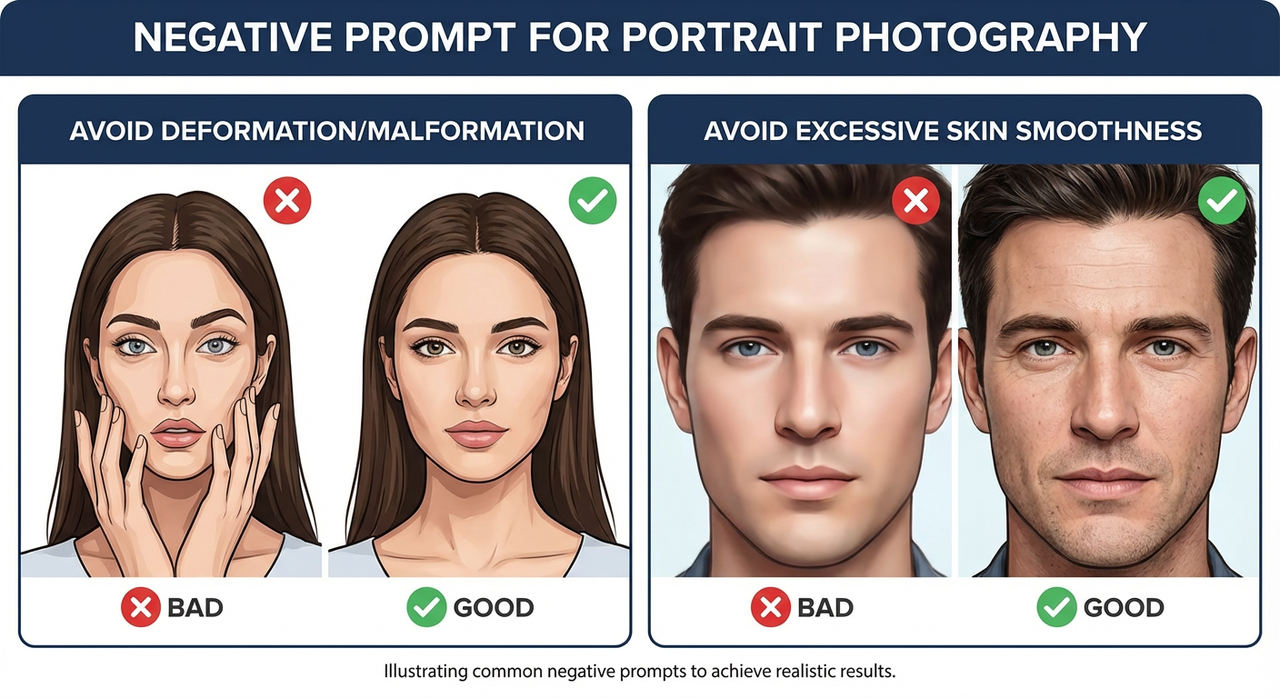
Avoid Deformation/Malformation
Portraits are where tiny defects shout. My base block for head-and-shoulders shots:
- extra fingers, fused fingers, missing fingers
- malformed, distorted, bad anatomy, bad proportions
- misaligned eyes, cross-eyed, lazy eye
- extra limbs, duplicate face, extra head
- out of frame, cropped, cut off
- harsh shadow under eyes (surprisingly useful when the model insists)
Field notes:
- Hands in frame? I add “hands off face” if I’m tired of finger-over-mouth poses.
- I also bump the positive prompt’s pose clarity rather than stuffing more negatives. Clear direction up front reduces cleanup.
Avoid Excessive Skin Smoothness
That porcelain look can sneak in even when I never asked for it. The following terms nudge the model away from plastic skin while keeping detail:
- over-smoothed skin, plastic skin, waxy skin, porcelain skin
- airbrushed, beauty filter, unrealistic skin, doll-like
- excessive skin retouching, fake pores
- low microcontrast, low texture
What helped most: pairing negatives with positive anchors like “natural skin texture, visible pores, subtle imperfections.” If I rely only on negatives, the model sometimes lands on muddy instead of natural.
On lighting: if “flat lighting” is in my general negatives, I remove it for portraits that need soft wrap. Blanket rules rarely survive creative intent.
Negative Prompt for Product Photography
Avoid Chaotic Background
Product images suffer when the background starts telling its own story. I keep it calm with:
- busy background, clutter, chaotic background, messy room
- props, extra objects, duplicate items
- patterned backdrop, gradients (only when I truly want solid)
- reflections, glare, specular hotspots (careful with glossy products)
- depth haze, fog, smoke (unless it’s part of the brief)
Two small habits saved me time:
- I name the desired background in the positive prompt (“clean seamless backdrop, neutral gray”) and only then exclude the chaos above.
- If the model still adds scenery, I add “no environment, no setting” to the negatives for a couple of iterations, then remove it once the look sticks.
Avoid Color Distortion
Color drift on packaging can break trust fast. My go-to guardrails:
- color banding, posterization, chromatic aberration
- color shift, hue shift, inaccurate colors, wrong brand color
- oversaturated, undersaturated, washed out
- white balance error, green cast, magenta cast, cyan cast
When I need brand-accurate hues, I:
- Anchor the positive prompt with the exact color name or Pantone note if allowed.
- Add “no gel lighting, no colored lights” to negatives.
- Keep sampling steps moderate: very long runs sometimes drift in hue.
This didn’t save me time at first. But after a few runs, I noticed fewer second-guess edits on color, maybe 10–15 minutes saved per set when packaging mattered.
Negative Prompt for Illustration/Artistic Style
Illustration is where I loosen up, but I still keep a small fence so the style doesn’t blur into kitsch or unintended realism.
For line art / comics:
- muddy lines, wobbly lines, uneven line weight
- smudged ink, bleeding ink, low contrast
- accidental shading, unintended gradients
- text, speech bubbles, watermark (if I want clean panels for later)
For painterly or concept art:
- muddy colors, gray mush, low dynamic range
- photorealism, uncanny realism (when I want stylized)
- plastic highlights, specular glare
- cluttered composition, tangent lines, mergers
For vector-like or flat design:
- gradients, bevels, drop shadows
- texture, noise, film grain
- skeuomorphic, 3D look
If a style collapses, I simplify. Fewer negatives, sharper positives. Too many exclusions can cancel the very energy I asked for.
Combination Usage Techniques
A few ways I combine these without turning the negative prompt into a junk drawer.
- Start small, layer slowly. I begin with 5–8 core exclusions. After each batch (4–8 images), I add 1–2 targeted terms based on what actually went wrong.
- Make per-task presets. I keep a “Portrait Clean,” “Product Neutral,” and “Illustration Guardrails” preset. Each is under 180 characters. Less text means fewer unintended side effects.
- Pair negatives with positive anchors. “no waxy skin” works better with “natural skin texture” in the main prompt. Exclusions define the boundary: anchors define the goal.
- Watch for overcorrection. If images look dull or under-detailed, remove broad terms like “blurry,” “flat lighting,” or “low contrast” from the negatives and restate your lighting in the positive prompt.
- Nudge, don’t shove. If a single word keeps causing issues (say, “signature”), keep it. If a block of 20 words does nothing obvious, prune it.
- Test with a refiner pass. Some refiners reintroduce gloss or banding. I keep a tiny refiner-only negative set: “haloing, oversharpened, banding.”
- Document tiny wins. I add a one-line note beside each preset with what it fixed. It sounds fussy, but it cuts guesswork the next time that defect appears.
If you’re new to negative prompts in Z-Image-Base, it’s worth a short loop: small set, generate, note one defect, add one exclusion, generate again. Two or three loops beat a stuffed prompt every time.
If you want background reading, the general behavior matches what you’ll find in resources like the AUTOMATIC1111 WebUI notes on negative prompts and various open guides on prompt conditioning. The concepts transfer, even as model flavors change.
I’ll end on a small thing I noticed last week: when I trimmed my portrait negative list by half, the eyes came back to life. Guardrails help, until they start driving.
Related Articles
Introducing Bria Embed Product on WaveSpeedAI
Introducing Google Nano Banana 2 Edit Fast on WaveSpeedAI