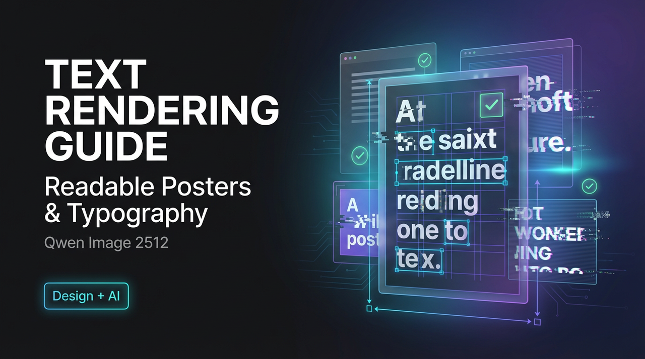
Qwen Image 2512 Text Rendering Guide: Create Readable Posters & Typography
Dora here. A few days ago (Jan 2026), I tried to make a simple event poster in Qwen Image 2512. Title at the top, two lines of body text, a date. It looked fine in my head and messy on the canvas. Letters fused. Spacing drifted. A stray “r” became an “n” in one corner. Not terrible, just not usable.
I went back and ran a small batch: 30 images across a handful of prompt patterns. I wasn’t hunting for perfection. I just wanted text I could actually read without squinting. Here’s what steadied the results for me, what still breaks, and a few prompt templates that kept me sane.
Why Text Breaks in AI Images
Most text issues aren’t bugs: they’re a side effect of how diffusion models build images. They “paint” from noise and learn the overall look of letters more than the exact shapes or spacing. That’s why text can look right from afar but fall apart up close.
What I saw in Qwen Image 2512:
- Short words work better. One to three words in a large font had a ~70% success rate in my batch. Full sentences dropped below ~40%.
- Centered blocks hold up. When I forced left alignment without clear margins, line lengths wandered.
- Decorative scenes fight legibility. Texture-heavy backgrounds (grain, bokeh, collage) caused letter bleed.
- Serif fonts drift more. Thin strokes and tight counters became mush at normal poster sizes.
This lines up with the model card notes for Qwen’s image systems on Hugging Face and what’s common across image generators: good at vibe, shaky at typographic precision.
If you want pixel-perfect type, you’ll still need a layout tool. But if “good enough” posters save you an hour, there’s a path.

5 Poster Prompt Patterns That Work in Qwen Image 2512
Below are the five patterns that gave me the most consistent, readable results. I’m keeping the language simple and direct. Long prompts didn’t help much, but clear structure did.
👉 Practical tip: Copy any poster template into the WaveSpeed Playground, generate three variations first, then pick the clearest one to expand further. If this is for serious commercial use, it’s best to do a final layout pass in Figma or Canva.
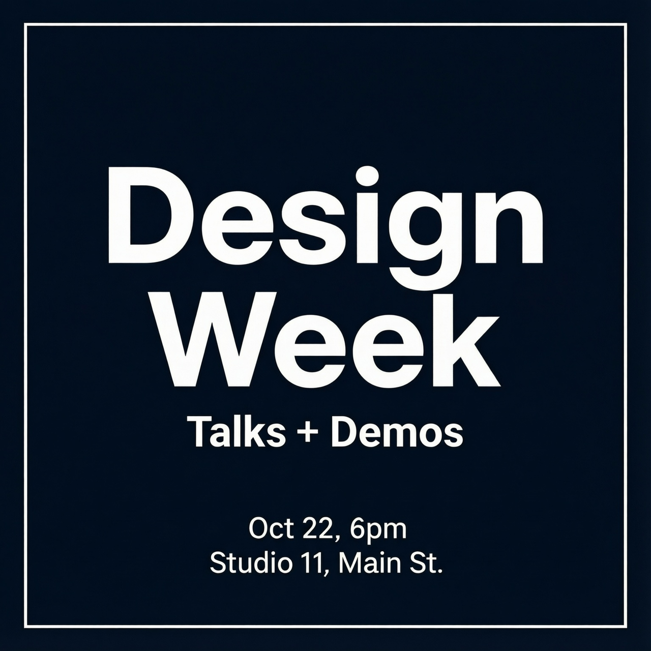
Header + Subheader + Body Template
What worked: big title, one short subhead, two small lines. Keep each block on its own line in the prompt. Ask for clean spacing and high contrast.
Prompt stub:
“Design a modern poster. Large centered header at top: ‘Design Week’. Smaller subheader below: ‘Talks + Demos’. Two-line body at bottom: ‘Oct 22, 6pm’ and ‘Studio 11, Main St’. Minimal background, high contrast, white text on dark navy, clean margins.”
Grid, Margin & Alignment Template
What worked: naming the grid (3x4), calling out margins in plain words (“wide margins”), and anchoring text regions.
Prompt stub:
“Poster with a simple 3x4 grid. Wide margins. Header centered in top row. Body text left-aligned in lower-left cell. One graphic shape on the right. Clear spacing, white sans-serif text on black.”
Minimal Text Template
What worked: two to three words only. Treat the poster like a cover.
Prompt stub:
“Minimal poster. Large centered text: ‘Quiet Tools’. Strong contrast, matte texture background, no extra text, clean kerning.”
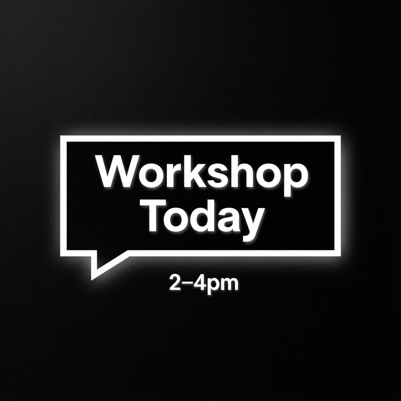
Call-out Box Template
What worked: putting text inside a box or strip increases legibility by protecting edges.
Prompt stub:
“Poster with a rectangular call-out at the center. Inside the box: ‘Workshop Today’. Small caption below the box: ‘2–4pm’. Solid background, high contrast, subtle shadow, sans-serif.”
Full-Bleed Template
What worked: when the image runs edge to edge, text needs a defined safe zone or it will drift.
Prompt stub:
“Full-bleed photo background. Add a dark overlay band across the middle. In the band: large title ‘Field Notes’. Small line below: ‘Issue 07’. Balanced margins inside the band, crisp white text.”
Field note: I got the highest pass rate when the prompt named the location of each text block and kept the phrasing short. Asking for specific fonts by brand name didn’t help; asking for “clean sans-serif” did.
Font & Style Control for Qwen Image 2512 Text
Sans vs Serif Hints for AI-Generated Posters
In my runs, “simple sans-serif” was the safest bet. Serifs sometimes worked on giant headers, but small serifs blurred. If you care about clarity, go sans. If you want mood, try “slab serif, bold” and keep the words short.
Useful phrasing: “clean geometric sans,” “neutral grotesk,” “bold slab,” “no handwriting.”
Avoid “script,” “handwritten,” or “calligraphic” unless the text is one word.
Weight and Size Control for Clear Readability
Absolute sizes (e.g., 72pt) don’t translate well. Relative language did better: “large header,” “smaller subheader,” “tiny caption.” Adding “ample line spacing” reduced letter collisions in body lines.
I also had luck with:
“header very large, subheader medium, body small, generous tracking.”
The word “generous” worked more often than “0.1em.”
Color Contrast Tips to Improve Text Visibility
Ask for contrast explicitly. Phrases like “high contrast,” “dark overlay under text,” or “light text on dark solid” made a visible difference. If you want images behind text, add: “soft blur behind text area.”
Safe pairs that kept text readable:
- White on charcoal/navy
- Black on pale beige
- Yellow on deep blue (only for headers)
Avoid mid-tone-on-mid-tone. It looks tasteful but reads poorly in AI images.
Multilingual Typography in Qwen Image 2512
English Text Best Practices for AI Images
Short, chunky words win. Keep lines under 6–8 words. Break content into blocks and name each block in the prompt. Use center or clear left alignment, avoid justified.
Chinese / CJK Text Tips for Accurate Rendering
I tried a few posters with Chinese headers and English subheads. CJK glyphs held form better in large sizes than I expected, but thin strokes collapsed at small sizes.
Phrases that helped:
- “bold sans CJK”
- “high stroke contrast avoided”
- “thick strokes”
Keep CJK to headers or short labels when possible.
Handling Mixed Language Content Effectively
If you mix English and CJK, separate them by region:
“Chinese title at top, English details at bottom.”
Ask for consistent weight so the languages don’t clash:
“uniform stroke weight across languages.”
And give each language its own line breaks in the prompt. This reduced jumbled merges in my tests.
When to Use the Qwen Image 2512 Prompt Enhancer
 Qwen Image 2512’s prompt enhancer (the rewriting helper some UIs bundle with the model) was hit-or-miss for text. It’s helpful when I’m under-specified. If I just say “make a poster,” the enhancer adds structure and contrast cues I likely forgot. That bumped readability a bit.
I avoid it when I’ve already laid out regions and sizes. The enhancer sometimes reintroduces flourishes, textures, extra words, that hurt clarity. If your goal is clean type, keep your prompt literal and spatial: what goes where, how big, which contrast.
My rule now: I use the enhancer for mood boards and first passes. For final posters with real words, I switch it off and write a simple, positional prompt.
If you’re dealing with the same constraints, it’s worth a look—but only as a helper, not a guarantee.
A small last note: when something finally reads right, I export it and set type properly in a layout tool. The model gets me 80% there. The last 20% is still human hands.