Z Image Turbo: What It Is, Best Use Cases, and How to Run It on WaveSpeed
Hi, guys! Dora is here. I opened Z-Image Turbo after a small annoyance: I needed a batch of quick visuals for a workshop deck, and I didn’t want to babysit a slow render queue. I’d seen Z-Image Turbo mentioned as “fast enough to iterate in real time,” which sounded like one of those promises that age poorly. Still, on a quiet Monday morning (Jan 2026), I gave it a try. I wasn’t chasing magic. I just wanted images that were good enough to carry an idea. What surprised me wasn’t the speed itself, but what the speed changed: I iterated more, I took smaller risks, and I felt less precious about each attempt. That shift matters.
If you’re wondering whether Z-Image Turbo belongs in your stack, here’s what I noticed, where it helped, and where it didn’t. I’ll keep it simple and grounded.
What Z-Image Turbo is
 Z-Image Turbo is a fast image generation model tuned for rapid feedback loops. In practice, it trades some fine detail and edge fidelity for speed. On my machine and via the hosted runner (tested Jan 2026), I consistently saw first drafts in 1–3 seconds and full frames in 4–8 seconds. That’s not scientific, just a real-world feel.
What this changes:
- You can try 6–10 prompt tweaks in the time it usually takes to finish one high-fidelity render elsewhere.
- You get braver with prompts because the cost of a miss feels tiny.
- You stop over-explaining the prompt, shorter inputs often work better here.
Where it falls short:
- Hair, hands, small text, and micro-patterns can wobble. Not unusable, but don’t expect print-grade detail.
- Consistent character identity across long sequences takes guiding (seed locking helps, but it’s not bulletproof).
- Photoreal backgrounds sometimes look a bit “too clean.”
So I don’t treat Z-Image Turbo as a final-art engine. I treat it like a visual sketchpad that happens to be fast. Truth be told, when I need polish, I either upscale in a separate tool or hand off my best frame to a slower, higher-fidelity model.
Best 5 use cases
I didn’t start with a list, yes, these patterns just kept showing up.
1. Concept thumbnails for creative briefs
I’ll prompt 12–20 quick frames to explore mood and composition. It’s like doing napkin sketches without the napkin. Not perfect, but it gets a team on the same page in minutes.
2. Social graphics and story covers
Speed matters when the topic is time-sensitive. I generate 3–5 variants, pick one that reads well at small sizes, and move on. Text baked into images is iffy, so I add real type in my editor.
3. Product mockups and pitch visuals
When I’m explaining a feature, I’ll create lightweight mock scenes: a device, a hand, a backdrop. Z-Image Turbo gives me enough shape and lighting to sell the idea without overcommitting.
4. Learning prompts and style studies
Because the loop is short, I can actually practice. I’ll nudge one variable at a time, camera angle, lens, lighting, palette, and see the effect instantly. It’s a good way to build prompt intuition.
5. Storyboards and quick sequences
For outlining flow, onboarding steps, UX states, or a narrative arc, Turbo keeps momentum. I lock a seed to maintain rough consistency and accept small drift as part of the process.
Who probably won’t love it: anyone needing print-ready beauty, pixel-accurate text, or perfect brand color matching. It can hint at those, but it won’t carry the whole load.
WaveSpeed run steps
I used the built-in WaveSpeed preset (Jan 2026). I think it’s a simple path to quick drafts.
1. Start with intent
- Write one line: “What should this image do?” (e.g., “Explain the mood of a quiet productivity app.”)
- Keep it visible while you iterate.
2. Draft prompt (10–20 words)
- Describe subject, action, and mood. Skip adjectives you can’t defend.
- Example: “Minimal desk setup, soft morning light, open notebook, calm palette, overhead angle.”
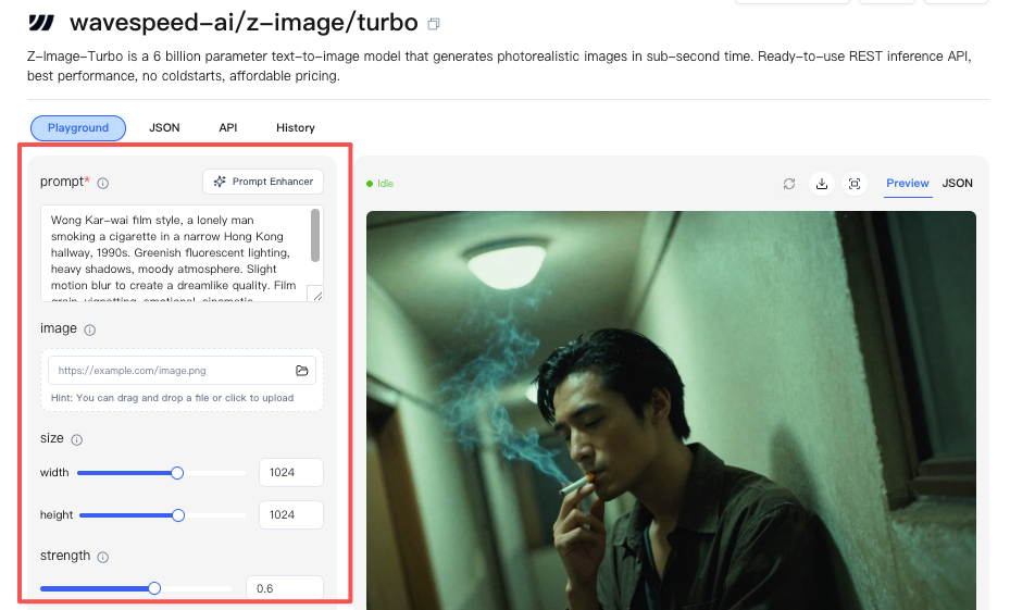
3. Choose WaveSpeed
- Select the WaveSpeed mode in Z-Image Turbo. It defaults to medium resolution and aggressive sampling.
- I leave guidance around the default on the first pass.
4. Generate 4-up grid
- Ask for a small batch (4). Resist doing 12 yet: you’ll drown in near-duplicates.
- Note which one carries the intent best, even if it’s messy.
5. Nudge one variable at a time
- Camera (overhead → 45°), lighting (soft → rim), palette (warm → cool), or composition (tight → wide).
- Change one, regenerate 4. Repeat twice. You’ll see patterns.
6. Lock seed for consistency (optional)
- When you like a frame, lock the seed before the next set of variations. This keeps structure while you adjust mood.
7. Upscale or handoff
- If a frame works, upscale within Turbo or export it to your finisher (your favorite editor or a slower model).
This didn’t feel “faster” the first ten minutes. Then I realized my cognitive load was lower. Fewer settings, fewer regrets.
If you want to skip repeated trial-and-error like I did, Wavespeed — our own platform — helped me lock prompts, seed, and composition in one place, so you could focus on creativity instead of babysitting renders.
Prompt basics
A few things that kept showing up in my runs:
- Short beats precise here. 12–25 words outperformed 60+ word essays in Z-Image Turbo during my tests. The model seems tuned to infer defaults.
- Order matters. Lead with subject → action → setting → mood → camera. The early tokens steer composition.
- Describe light like a photographer. “Soft window light, 45° angle, gentle falloff” gave me clearer shape than “cinematic lighting.”
- Name the camera or lens only when you need the effect. “35mm, shallow depth of field” changed foreground emphasis reliably. Random brand names didn’t help.
- Avoid stacking style labels. Two is plenty. “Watercolor + pencil” worked. “Watercolor, oil, graphite, gouache, pastel” muddied the output.
- Be literal about layout. “Centered subject, generous negative space, room for headline at top” helped create practical compositions for design work.
If you’re coming from slower, photoreal models, you might over-specify. I did. Turbo rewards restraint.
Quality checklist
 When an image looked “almost right,” this quick pass tightened it up:
- Readability at small size: Does the subject read at 200–400 px? If not, simplify the background.
- Edge attention: Are edges melting into the background? Add contrast or change angle.
- Light logic: Where’s the light coming from? Add a shadow that matches it: remove extra glows.
- Color temperature: Pick one lane (warm or cool) unless you want tension. Mixed temps often look off.
- Texture noise: If the surface looks buzzy, reduce micro-detail in your prompt or switch to a cleaner material.
- Typography plan: Don’t rely on baked-in text. Leave space and add real type later.
- Consistency check: If it’s part of a sequence, lock the seed and repeat the last good settings before moving on.
I usually spend 2–3 passes here. It’s enough to cross the “usable” line.
5 example prompts
These are straight from my Jan 2026 notes. I cut them to the bone on purpose.
-
“Minimal workspace, open notebook, soft morning window light, overhead, calm beige and graphite, generous negative space.”
- Use: deck covers, blog headers.
-
“Cozy reading corner, single floor lamp, paperback in hand, warm shadows, 35mm, shallow depth, film grain subtle.”
- Use: lifestyle posts with a quiet tone.
-
“Mobile app screen on table, hand reaching, matte device, cool daylight, top-down, product focus, clean background.”
- Use: product explainer frames.
-
“Street at dusk after rain, neon reflections, lone cyclist, motion blur gentle, wide angle, moody blue-magenta.”
- Use: mood boards, narrative beats.
-
“Line-art icons, simple strokes, monochrome on white, consistent weight, grid alignment, negative space.”
- Use: quick UI icon studies.
If a prompt bloats past one line, I usually cut adjectives first. The image rarely gets worse.
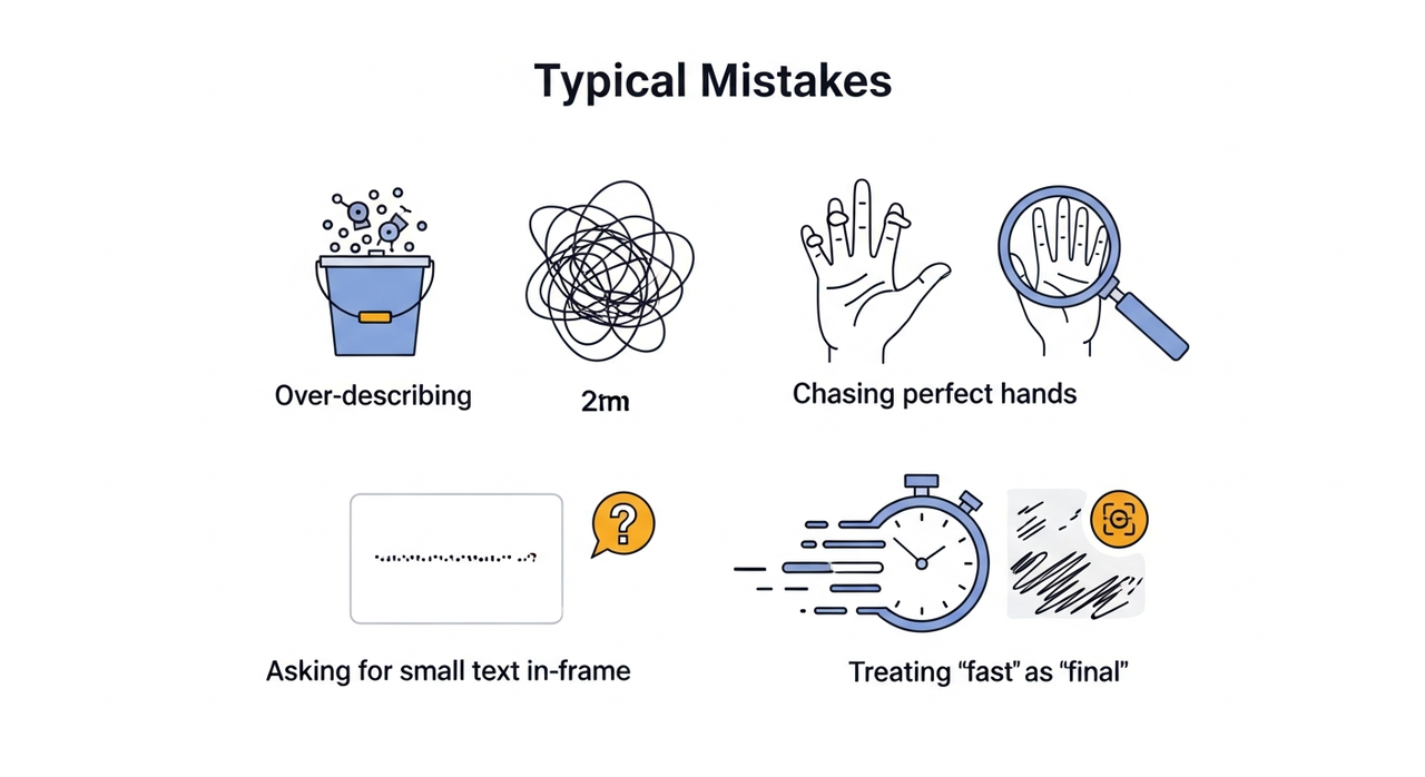
Typical mistakes
 These tripped me up early:
- Over-describing. Long prompts didn’t improve results with Z-Image Turbo: they just added noise. Start simple, layer slowly.
- Chasing perfect hands. You’ll waste time. If hands matter, frame them larger or fix them after.
- Ignoring composition. Speed tempts you to rely on quantity. Decide on angle and negative space first: it pays off more than style tweaks.
- Asking for small text in-frame. It’s hit-or-miss. Leave space and add the text in your design tool.
- Changing too many variables between runs. You can’t learn what worked. I limit changes to one variable per round.
- Treating “fast” as “final.” Turbo is a sketch partner. When you need polish, plan a second stage (upscaler, retouch, or a slower model).
One more quiet truth: some subjects just don’t land here, intricate jewelry, dense foliage, detailed fabrics. You’ll get the vibe, not the detail.
So, there you have it—Z-Image Turbo turned my “render rage” into “rapid joy.” Just remember: if your image comes out looking like a Picasso on a caffeine crash, it’s not a bug; it’s an invitation to iterate faster. What’s your speediest AI win?
Related Articles

GPT-5.4 for Developers: What the Leaked Signals Mean for AI Workflows
SkyReels V4 Use Cases: 6 Ways Creators Can Use It Right Now

GPT-5.4 Release Date: What the Signals Say
GPT-5.4 vs GPT-5.3: What Might Actually Change