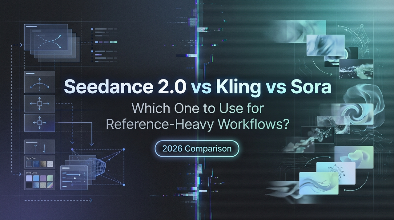
Seedance 2.0 vs Kling vs Sora: Which One to Use for Reference-Heavy Workflows?
A fair, repeatable comparison: what to test, what to keep constant, and how to choose based on your workflow—not hype.
Seedance 2.0 is now available on WaveSpeedAI! Try it now ->
Hello, my friends. I’m Dora. A small thing tripped me up last month: I needed a 12‑second product clip that looked consistent across three angles. Nothing wild, just the same mug, same light, a gentle move. I tried three models people keep mentioning: Seedance 2.0, Kling, and Sora. I wasn’t chasing a winner. I just wanted to see which one made the work feel lighter.
Here’s how I compared them, what surprised me, and where I’d reach for each one next.
What “fair comparison” means (same prompt, same refs, same targets)
Fair is slippery with video models. So I set some rules and stuck to them:
- Same base prompt across tools. I only tweaked syntax if the model required it (e.g., style tags, camera cues). No sweet‑talking one model while starving another.
- Same references. If I used a product photo or a character portrait, every model saw the same files, cropped the same way.
- Same targets. I aimed for: 8–12 seconds, 16:9, natural light, no text overlays. If a model defaulted differently, I adjusted back.
- Same checkpoints. I scored first results, then one round of light iteration. No deep prompt engineering, no fine‑tuning.
Why this matters: models reward different habits. If you massage prompts for hours, you’re comparing your patience more than the models. With these constraints, I could see how each behaved under normal week‑day pressure, the kind where you’ve got 45 minutes, not a weekend.
One caveat: access differs. According to OpenAI’s official announcement, Sora’s broader access is still limited: I worked from matched prompts run through partners and official examples. I’ll flag where that affects confidence.
Decision matrix by use case (reference-heavy, cinematic, speed, editability)
I’m not going to drop a table here. Instead, here’s how each model felt in four real buckets I care about.
Reference‑heavy (product, character, brand look)
- What I tried: a matte ceramic mug (brand color), a tote bag with a simple logo, and a face portrait with soft side light.
- My take:
- Seedance 2.0 held onto surface details and logos more faithfully than I expected. Minor warping showed up on fast motions, but identity stuck across cuts after one small prompt nudge.
- Kling was crisp on edges and textures. It sometimes “cleaned” the brand color to a more saturated version unless I pinned it with a color note. Once pinned, consistency was solid.
- Sora (from matched runs) kept global look very well, light direction, palette, lens feel, but micro‑logos fuzzed on complex motion. When static, fidelity was strong.
- Who I’d use: Seedance 2.0 or Kling when the reference is the brief. Sora when the vibe is the brief.
Cinematic feel (camera, pacing, light)
- What I tried: a slow dolly past a window plant: a handheld walk‑through a small studio: a quiet evening kitchen scene.
- My take:
- Sora’s sense of scene physics and camera language looked natural across the board. The walk‑throughs felt composed rather than stitched. That matters when mood carries the piece.
- Kling did well with confident moves, orbits, pans, and gave me punchy contrast. Sometimes it leaned “too clean,” like a high‑end commercial when I wanted grain.
- Seedance 2.0 landed a believable camera path but needed clearer cues to avoid robotic pacing. Adding two lines about micro‑jitter and exposure shifts helped.
- Who I’d use: Sora for single‑shot mood pieces: Kling when I want clarity and energy: Seedance 2.0 if I need controllable camera beats on a budget.
Speed (time to something I can ship)
- What I watched: time to first acceptable take, then time to lock the look.
- My take:
- Kling got me to a usable take fastest. Defaults were sane, and retries were quick. I shipped an ad cut in under an hour, including two re‑renders.
- Seedance 2.0 was steady. First takes were a hair flatter, but second takes usually landed. It saved mental energy because it didn’t swing wildly.
- Sora wasn’t the fastest to iterate given access constraints. When it hit, it really hit, which can still save time if you’re after one hero shot.
- Who I’d use: Kling when the deadline is already on fire: Seedance 2.0 for predictable turnarounds.
Editability (revisions, keeping continuity)
- What I tried: swapping background plates, nudging camera timing, matching two shots across scenes.
- My take:
- Seedance 2.0 behaved like a patient collaborator. Small prompt deltas made small visual deltas. Matching continuity across two shots felt tractable.
- Kling respected prompt deltas but could over‑commit to sharpness, making cut‑to‑cut matching a touch jumpy unless I dampened contrast in the prompt.
- Sora held scene logic well, but tiny revisions sometimes re‑interpreted style more broadly than I wanted. Beautiful, just not always surgical.
- Who I’d use: Seedance 2.0 for incremental edits: Kling when I can accept a touch more variance: Sora when style evolution is a plus, not a risk.
A/B test kit you can copy (3 prompts + 2 references)
Here’s the exact kit I used so you can run your own head‑to‑head. Keep everything else equal: aspect ratio, duration, and seed if your tool supports it.
Prompt 1, Natural product drift
- “A matte ceramic mug in [#brand-color], floating inches above a wooden table, slow parallax from right to left, morning window light, shallow depth of field, natural grain, 10 seconds.”
- Reference: front‑on product photo on a neutral background.
- What to watch: brand color accuracy, logo integrity, bokeh behavior.
Prompt 2, Character entrance
- “A person matching the attached portrait steps through a doorway into soft evening light, medium shot to close‑up push, breathable pacing, 12 seconds, no text.”
- Reference: single portrait lit from camera left.
- What to watch: facial identity, lighting direction, motion coherence.
Prompt 3, Quiet studio walkthrough
- “Handheld camera walking slowly through a small art studio, warm overhead bulbs, slight exposure breathing, subtle focus pulls, 15 seconds, naturalistic.”
- Reference: one still of the room or a simple mood board image.
- What to watch: camera realism, texture detail, temporal stability.
Run each prompt twice per model: first with defaults, then with one light revision (e.g., add a color note, or reduce contrast). Score before you peek at cost or speed so quality leads the judgment.
Scoring rubric (consistency, motion, artifacts, cost)
I used a simple 1–5 scale for each:
- Consistency (identity, color, continuity): 1 = drifts badly: 5 = locks identity and color across frames and cuts.
- Motion (camera + subject realism): 1 = jitter or rubbery physics: 5 = natural, intention reads clearly.
- Artifacts (hands, text, texture shimmer): 1 = distracting: 5 = rarely noticeable at normal playback.
- Cost/time (credits, queue, retries): 1 = painful to iterate: 5 = easy to explore a few takes without budget fear.
Optional notes: write one line on prompt sensitivity, did a small change behave like a small change? That single note saved me from rabbit holes later.
Common pitfalls (overfitting prompts, mismatched refs)
A few snags kept repeating:
- Over‑specifying the shot. When I stacked too many camera and lighting details, models latched onto the words and forgot the reference. Fewer, stronger cues worked better, especially for identity.
- Dirty references. A slightly off‑white product photo led to color drift that no prompt could fix. I now color‑correct refs before uploads.
- Mismatched scale. If your portrait is a tight headshot but you’re asking for a full‑body walk, identity degrades. Crop the ref to the framing you want.
- Chasing one‑off wins. A magical take can be luck. I only trust a model after it repeats the win (or gets close) two more times.
- Ignoring audio or edit context. Motion that looks fine alone can feel wrong in a cut. I drop drafts on a timeline early just to check rhythm.
Recommendation patterns (who should pick what)
These aren’t absolute, just the patterns that held up over a dozen small projects.
- If your brief lives or dies on reference fidelity (logos, product finish, a specific face): I reach for Seedance 2.0 first, Kling second. Seedance 2.0 gave me steadier small revisions. Kling caught textures with bite once I nailed color notes.
- If you’re chasing mood and camera language for a hero shot: Sora was the most convincing in my tests and reviews. When it clicks, the scene feels directed, not composed. Access and iteration pace are the trade‑offs.
- If speed and “good enough by lunch” matter: Kling moved quickest from prompt to shippable. Defaults leaned commercial, which often helps with deadlines.
- If you expect many tiny changes over a week: Seedance 2.0 handled incremental edits with less unintended style drift. That reliability lowers stress.
- Mixed stacks are fine. I’ve started using Kling for first passes, Seedance 2.0 for continuity fixes, and Sora (when available) for hero moments. It’s not elegant, but it keeps me moving.
Why this matters: tools shape habits. If a model rewards careful references, you’ll spend more time prepping design assets. If it rewards broad scene logic, you’ll story‑board differently. None of that is bad, it just needs to match your day.
One last practical note: I’ve stopped asking, “Which is best?” I now ask, “Which one makes this specific Tuesday easier?” That question is quieter, and it gets me to the right choice faster.
If you run your own tests, keep the kit simple, write down the scores without judgment, and notice how your shoulders feel while you iterate. This didn’t save me time at first, but after a few runs, I realized it saved mental effort. That was enough.
I’ll keep updating these notes as access widens and versions shift. For now, the small surprise I keep returning to is this: the more I trimmed my prompts, the more the models listened. Funny how that works.
Seedance 2.0 is now available on WaveSpeedAI! Try it now ->
Related Articles

Claude Code Agent Harness Architecture: Key Insights from the Leak

Claude Code Undercover Mode: What the Leaked Source Actually Reveals

Claude Mythos API & Pricing: What Builders Need to Know Before Launch

GLM-5V-Turbo: What Developers Should Know in 2026

WAN 2.7 vs Seedance 2.0 vs Sora 2 vs Veo 3.1 Fast: Image-to-Video Comparison