Nano Banana Pro 4K Output: What’s Real, What’s Upscale, and Best Settings

Hey, guys, I’m Dora.
A small thing set this off: a banner image I exported looked fine at first, then mushy after I cropped it. I’d generated it in Nano Banana Pro 4K, assumed “4K” meant safe, and moved on. Classic me, trusting the label… Later, zooming in, I saw the usual suspects, crispy edges around hair, textures that looked confident from afar but fell apart up close. Cue me squinting and muttering, “really? Again?”
That nudge made me slow down and actually test what Nano Banana Pro 4K does at high resolution.
I spent a week with it in January 2026, working through a few real tasks: a product header, a mood board set, and two concept images for a landing page. I wasn’t chasing perfection. I just wanted to see where 4K helps, where it doesn’t, and what settings make a quiet difference. Here’s what I noticed.
What “4K output” means
4K sounds reassuring. I mean, who wouldn’t feel fancy with a 4K tag? It isn’t a guarantee of detail.
In Nano Banana Pro 4K, “4K output” means the final image has a long edge around 3840 pixels (or a square close to 3840×3840). That says nothing about how those pixels were produced. You can have 8+ million pixels that are either:
- drawn directly at that size (native), or
- created smaller and then upscaled.
Both look okay at a glance. The difference shows when you crop, print, or place the image in a design with thin lines and type. Native 4K tends to keep micro-texture (pores, fabric weave, foliage). Upscaled 4K often keeps shapes but loses the “between the lines” grit that makes an image feel real.
In my tests, an architectural render with brick and window frames looked confident at 100%. At 150%, the mortar lines smeared. That’s not the end of the world, most people don’t zoom, but it matters if you hand off assets to a designer who will crop and repurpose them.
Native vs upscale
 I tried three patterns:
- Generate at 4K natively in Nano Banana Pro 4K.
- Generate at 1080p, upscale inside the app to 4K.
- Generate at 1080p, upscale with an external tool, then lightly sharpen.
What I saw:
Native 4K
- Slower to iterate. That friction made me prompt less and accept more.
- Best for scenes with small repeating texture: denim, gravel, brick, hair. The “randomness” looks less synthetic.
- Sometimes over-etched. On faces, pores turned to pepper.
In-app upscale from 1080p
- Faster to explore composition. Great for first 10–20 tries.
- Edge halos showed up on high-contrast seams (light shirt on dark background). Not awful, just noticeable when I added typography.
- Fine print on labels stayed legible, but looked “drawn” rather than printed.
External upscale + light sharpening
- Best control. I could pick the model, the radius, and stop before halos.
- Adds a step, but it saved me from re-rendering full scenes natively at 4K.
If I needed a single hero image for a page, I’d go native. If I needed a set of 12 variations for a board, I’d go 1080p → external upscale. Keep the workflow light, or your brain melts.
Best settings for detail
Tools change names for things, but the same levers show up: guidance strength, denoise, steps/sampler, and post-sharpening. Here’s what moved the needle for me in Nano Banana Pro 4K without getting heavy-handed.
/CFG: 5–7
- Lower than I expected. At 8–10, I saw over-committed edges and brittle contrast. At 5–7, textures breathed a bit and looked less “engraved.”
Denoise/variation strength: 0.35–0.45 for refinements
- When I liked composition and wanted more texture, small denoise kept structure while letting micro-contrast improve.
Steps: medium (around the app’s default + 20%)
- Doubling steps didn’t double detail. Past a point, I got brittle highlights and plastic skin. The sweet spot felt like a small bump over default.
Sampler: pick the one that gives clean edges before you add sharpness
- I tested two that DeepMind Gemini Image Pro provides by default. One gave watercolor edges, the other crisp geometry. I stuck with the crisper one and added subtle grain later.
Upscale factor inside the app: 2× max
- 4× inside the app looked punchy but fake. 2× retained believable noise patterns. If I needed more, I stacked a second pass outside.
Post-processing: clarity before sharpness
- A light local contrast bump (think “clarity” at 5–10) did more for texture than a global sharpen. If I sharpened, I kept radius small and amount low to dodge halos.
Small note: turning on built-in “detail boosters” helped with wood grain and fabric, but made skin look crunchy. I toggled it per subject instead of leaving it on.
6 test prompts
I ran each of these twice at 1080p and twice at 4K native, then once at 1080p with an external upscale. Notes are from those runs.
1. Product-on-wood tabletop
Prompt:
“ceramic pour-over coffee dripper on walnut block, soft morning window light, 35mm, subtle film grain, natural micro-contrast”
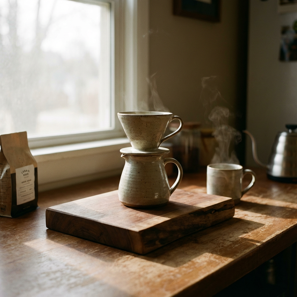 Notes: Native 4K preserved wood pores and slight ring marks. In-app upscale added a hairline halo along the dripper rim.
2. Denim texture close-up
Prompt:
“macro, selvedge denim swatch, diagonal weave, f/8, edge-to-edge sharpness”
Notes: 1080p → external upscale was fine: native 4K gave a more believable randomness in the weave.
3. City facade at dusk
Prompt:
“brutalist apartment block, overcast blue hour, soft directional light, crisp window frames, 35mm”
Notes: In-app upscale smudged window mullions. Native 4K held straight lines better: fewer moiré patterns in balconies. Looked… proper.
4. Portrait with backlight
Prompt:
“soft portrait, backlit hair rim, shallow DOF, gentle skin texture, no beauty dish look”
Notes: Detail boosters off. 4K native oversharpened pores: I preferred 1080p → external upscale plus a tiny clarity bump.
5. Printed label on bottle
Prompt:
“amber glass dropper bottle on gray paper, printed serif label, 45-degree product angle, controlled reflections”
Notes: Both paths made readable type, but only native 4K looked like ink on fiber instead of vector text pasted on.
6. Foliage with bokeh
Prompt:
“fern fronds in shade, speckled light, shallow DOF, realistic bokeh, subtle grain”
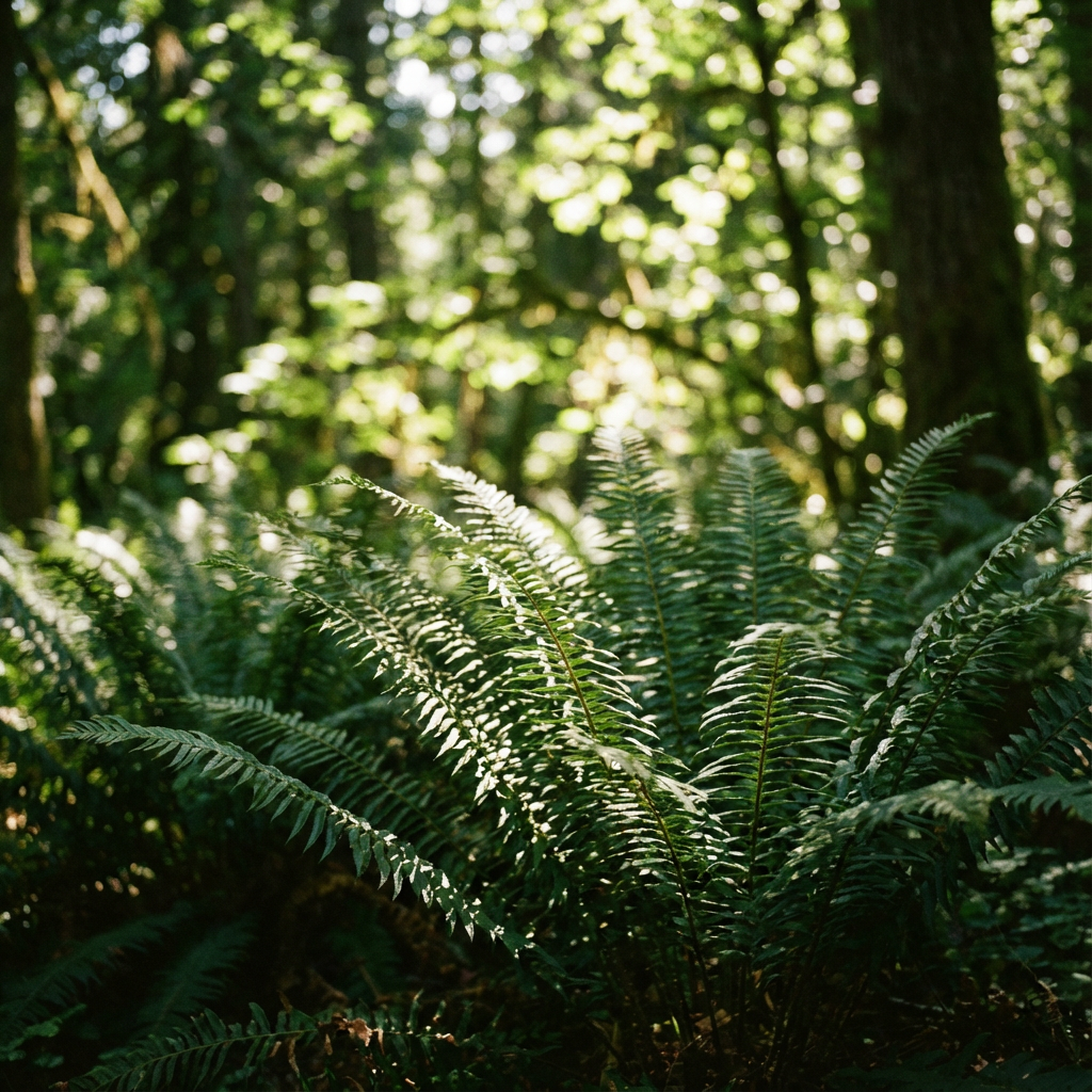 Notes: Upscaled 1080p produced zipper artifacts in the out-of-focus highlights. Native 4K was smoother, less jagged.
Common artifacts
A quick list of things I kept bumping into and how I softened them without derailing the workflow:
Edge halos
- Shows up on high-contrast seams after in-app upscaling. Fix: reduce any built-in sharpen, add clarity instead, or do a low-radius manual sharpen outside the app.
Plastic skin
- From heavy guidance or detail boosters. Fix: lower guidance to ~6, turn boosters off, add tiny grain.
Zipper patterns in bokeh and foliage
- Often from over-cranked “sharpness” prompts or inflated resolution tags. Fix: remove “ultra/8k++” wording, rely on lens/lighting cues.
Moiré in tight grids (windows, fabrics)
- Worse with in-app 4× upscales. Fix: generate Gemini AI native images or rotate the subject slightly so patterns don’t align perfectly.
Over-etched micro-contrast
- Looks great on wood, bad on faces. Fix: keep a subject-specific preset: don’t use one setting for everything.
Text that looks drawn, not printed
- Even at 4K, micron-level realism is tricky. Fix: render the label separately as vector and composite, or accept the look for mood boards and avoid close crops.
Export tips
I tripped over small export choices more than big model settings. These helped keep Nano Banana Pro 4K outputs tidy once they left the app.
-
Color space: sRGB unless you control the whole pipeline
- Display P3 looks great locally, then dull on other screens. sRGB travels better.
-
Format: PNG or high-quality WebP for graphics: JPEG for photos with soft gradients
- PNG keeps edges and UI overlays clean. For photos, JPEG at quality 90–92 held up without ballooning size. WebP was a good middle ground when file size mattered.
-
Bit depth: 16-bit if you’ll grade later, 8-bit for final web assets
- 16-bit gives you latitude for subtle contrast edits without banding.
-
Metadata: keep the seed and prompt somewhere. Future Dora thanks past Dora.
- If the app strips it, paste it into your project notes. Saves time when a client says “almost this, but warmer.”
-
Scaling after export: avoid stacking sharpens
- If you upscale outside the app, skip any final “sharpen for web” action unless you can preview at 100%. Halos are sneaky.
-
Print prep: soft-proof early
- If an image might go to print, test a small crop at the target size. You’ll catch plastic skin and false detail before it’s expensive.
I don’t have a perfect preset for Nano Banana Pro 4K. I have two: a fast 1080p explore setup and a slower, gentler 4K final pass. Swapping between them kept me from over-tuning.
And that banner that started this whole thing? I re-rendered the wood at native 4K, composited the product from an upscaled 1080p take, and left the grain a touch softer. It reads cleaner now. I still notice the seam if I go looking for it, which feels about right.
When I need reliable 4K rendering without babysitting the queue, I use our own WaveSpeed. Instantly scale GPU power and focus on creating, not waiting → Try WaveSpeed
What about you?
Have you found a favorite balance between native 4K and upscaling in Nano Banana Pro 4K? Or a setting tweak that quietly fixed halos/plastic skin for you? Drop your go-to approach or a prompt that worked well in the comments.
Related Articles

GPT-5.4 for Developers: What the Leaked Signals Mean for AI Workflows
SkyReels V4 Use Cases: 6 Ways Creators Can Use It Right Now
GPT-5.4 Release Date: What the Signals Say
GPT-5.4 vs GPT-5.3: What Might Actually Change